

The U.S. Men’s and Women’s National Team have a new look as they head towards vital matches in the coming months.
U.S. Soccer unveiled a new red Nike kit on Tuesday. The USMNT will begin wearing the kit in March’s key World Cup qualifiers against Panama and Honduras while the USWNT will introduce the kit during the SheBelieves Cup, which is set for March 1-7.
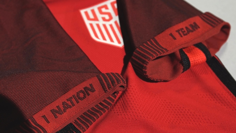
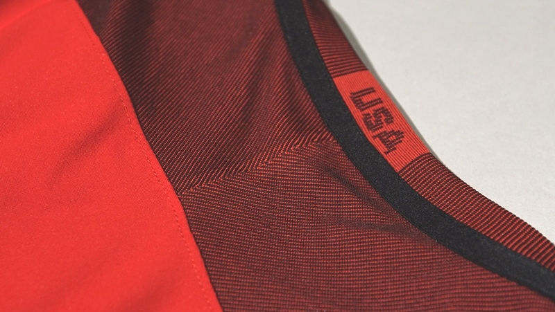
The kit features a similar design to the current U.S. Soccer uniforms, while featuring an all-red colorway. The tops feature “1 Nation” and “1 Team” across the opposing sleeves, while displaying “USA” across the neckline.
Here’s a closer look at the new kit:
Roses are red
Violets are blue
We dropped a red jersey
We hope to see it on you pic.twitter.com/aPPfitJ5R6— U.S. Soccer MNT (@USMNT) February 15, 2017
—
What do you think of the new kit?
Share your thoughts below.
I liked it till I got to the sleeves. Looks like two different shades of red on the same shirt. Clash!!
I have dubbed this kit: THE RED WEDDING
Not a fan. I think Nike has served the US badly over the years.
U20 WC qualifiers on univison deported, on direct TV it’s channel 464
Deportes
You still pay for cable? 🙂
Also on Facebook Live from the Concacad Facebook page
In a vacuum, it’s not a bad kit. But, consider that 1) multiple other national teams and professional teams have already worn this exact template, 2) There is so much potential for fantastic USA designs and 3) Nike has repeatedly been underwhelming on delivering a unique, American kit design. This simply builds on the reputation Nike has developed as lazy and uninspired when designing for this program. This kit is simply another in a line of Nike failures….
Agreed. I do think it is better than the black one with two different sleeve colors. I always think red looks pretty sharp. (our mainly red, with white and blue kits from the last world cup stood out) They should hire someone to create the design, then Nike can produce it. Maybe find whoever designs SKC kits.