Photo by ISIphotos.com
If you were watching the U.S. Olympic team play and felt like something was missing, it’s because something was.
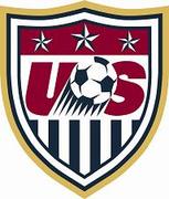
The U.S. Soccer crest (pictured below) that is emblazoned on every U.S. national team uniform was not on the U.S. Olympic team uniform for the men or the women for their opening matches. The reason? According to a U.S. Soccer official, The International Olympic Committee does not allow national governing bodies to include their crests on their uniforms during the Olympics.
If you have seen other teams with crests, it is because the national federations for those countries have ignored the IOC mandate, and are subject to fines by the IOC.
So no, there wasn’t a laundry fiasco and nobody made off with the crests. There’s your answer to the missing crests question.


Get rid of the stars. Stars are for World Cup champions.
I echo what others are saying, the crest sorely needs to be redesigned (so does the uniform, but that’s another story). The “Don’t Tread” crest was pretty darn cool, but I’d settle for an eagle too. Really, I’d just settle for something from this century. And by the way, totally classless on our part to tape the logo. Suck it up and take the fine, everyone else seems to have.
In light of recent results lets just keep the jersies crest-less . . .seems to be working out ok!
The reason why nations like the U.S., Japan, and Brazil are not wearing their football association crests are because they are all in the running for the 2016 summer games (Chicago, Tokyo, Rio respectively). So they don’t want to PO any Olympic officials and make any waves that could affect voting for the 2016 games. The other countries not in the running could care less (which is why they are ignoring this silly mandate).
Wait, Kenny Cooper’s dad is from England?
The US Crest would look better without the soccer ball, and they should take the stars off as well seeing as we have never won a WC.. . Maybe a complete overhaul would be in the best interest of the US Soocer Federation.
1. Leave the ball, but take away the streaks under it.
2. Remove gold trim.
3. Have the letters U & S straight up, not italic
4. Make the upper portion blue back ground instead of red
5. Make the 3 stars solid white
6. Make the blue stripes red.
Appreciate it if someone could help me on this one, as I’ve never been able to find the info…
What do the stars on the badge actually represent?
Of all the things I expected to find mentioned in a soccer blog, Infowars is one of the last.
Can Texas secede already? I have to admit a crest based on the Gonzales flag would be cooler than the other side of the pillow.
Anyone know if these rules were in place last Olympics, and if they were followed?
I also like the Don’t Tread ball & snake logo, but without the wordmark, which is redundant (and strikes me as chip-on-shoulder posturing).
The current crest has to be completely trashed. I’ll even go so far as to say that no stars should appear *anywhere* if USA doesn’t have a WC win to its name. Yes, I’m fully aware that there are stars on the flag.
Thank goodness. For a moment, I thought that X the Eliminator had invaded Beijing.
i believe the poster complaining about the don’t tread slogan meant putting a nike 2 word slogan of “Don’t Tread” was a bad idea.. i’m sure he is aware (at least i hope so) that the full national slogan was “don’t tread on me”. i agree with him.. it should not be the nike 2 word slogan.
im canadian and even i know the origins of that slogan and have seen it on old school flags. that would help make a pretty cool crest.. now if only we could get the CSA to change theirs… 🙁
I really like the crest we used on this kit:
http://bp0.blogger.com/_oSw4NL7oBFk/RocpePdvtoI/AAAAAAAAAB8/dLKvYmF2wB4/s1600-h/dtom.jpg
Posted by: Brett | August 08, 2008 at 12:17 AM
Hell yes…put that on the current home shirt and let it become iconic.
So what you are telling me is that we as the USA are actually respecting the rules of international bodies? wow……..
I don’t like to bash other posters…but crew fan is one of the dumbest yet.