

A long-standing criticism plenty of fans have had about U.S. Soccer over the years is the design of its crest, but the current look might soon hit its expiration date.
U.S. Soccer will unveil a new crest next year and a report from FootyHeadlines.com suggests it will look somewhat similar to the centennial crest that earned rave reviews back in 2013.
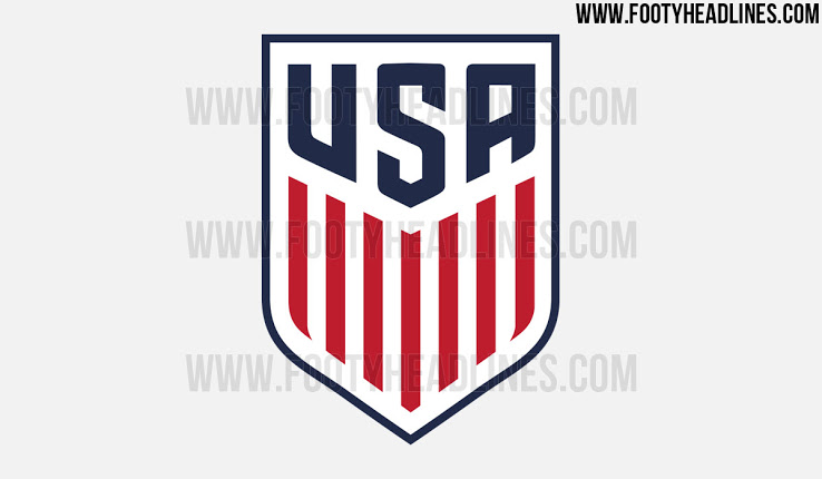
The new crest will be a blend of sorts of the current one and the one used to celebrate 100 years of U.S. Soccer. It will reportedly include the 13 vertical lines, seven red and six white, that were on the centennial one and boast the words USA on top of that instead of the soccer ball and “U.S.” that occupies the current one. The shades of blue and red are also a bit darker.
It remains to be seen if this crest replaces the current one, but U.S. Soccer had been contemplating a change after seeing the overall positive responses to the centennial crest. The current crest has been with the U.S., more or less, since 1993, and is constantly criticized.
U.S. Soccer has yet to address the latest reports, and a call seeking comment has yet to be returned.
What do you think about the proposed U.S. Soccer crest? Do you like it? Prefer the current one?
Share your thoughts below.