The U.S. Men’s National Team’s latest home jersey has allegedly been leaked, and it is likely to raise some eyebrows.
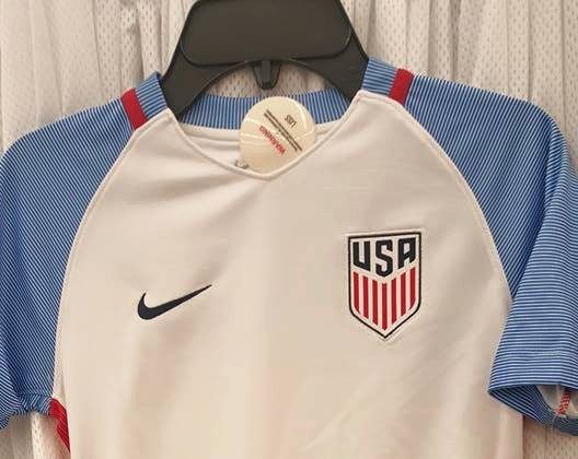
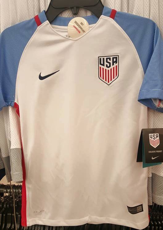
On Saturday, the American Outlaws D.C. Chapter posted an image of what is believed to be the new home jersey that the USMNT will wear during this summer’s Copa America Centenario. The new U.S. Soccer crest sits on a white base, while the sleeves comprise of thin blue lines.
The revealing of the home jersey comes more than week after the new away jersey was allegedly leaked. It has been reported that the Americans will suit up in new jerseys in the upcoming World Cup qualifiers vs. Guatemala at the end of the month.
Footy Headlines also recently leaked the pre-match jersey for the Copa America tournament, and it features red and blue.
What do you think of this reported new USMNT home jersey? Like the light blue color of the sleeves? Wondering what the heck is going on with Nike’s design team?
Share your thoughts below.
This is what I was looking for. Thanks
WALDO KITS 4 LYFE!!!
Woof.
Well at least the jersey and the shield represent our play on the field… 🙁
This is one of the great threads of the year. Thank you to everyone for the entertainment.
Centennial and Waldo jerseys were the best of recent years.
Right after the centennials went off the market I got a gift certificate to the US Soccer store. I figured I’d use it on the next USMNT jersey I liked.
It’s now been over 3 years and I am still just holding a gift certificate.
Crap that’s ugly!
Most people here don’t like it because it really looks faggedy.
More Sunil crap!!! How long until we can get rid of this guy???
lol
we need to come up with a jersey that identifies us as the US and not this crapshoot that goes on almost every year! I liked the navy blue 2012 away kit! And the 2015 away kit!
http://www.socceroverthere.com/?page_id=14607
when I die, I want the us soccer uniform designers to lower me into my grave. that way they can let me down on more time.
I bet it will look great on the women’s team
The away jersey is a refried abortion. This is better but more fitting for the 1920 olympic bobsled team. The fans want red. Give us red. The where’s waldo hoops jersey was fantastic.
Is this a fashion blog? So many posts and comments about crests and uniforms – who cares?
“So many posts and comments about crests and uniforms – who cares?”
Er, the many people that post and comment about crests and uniforms … ?
Don’t you worry though SLA, it’s not required that you post or comment if you don’t care.
I’m not interested in fashion–I dress like a color-blind alcoholic–and consider myself someone who cares more about function than form, substance than surface appeal. That said, a uniform and badge help to represent a team, and in this case, a culture and country.
It’s okay that you don’t care about this stuff, just like it’s okay that some of us do. There are probably some people that ONLY care about uniforms and crests, and guess what? This is the perfect article for them to pop up and share their opinions because this article is about a jersey, a frickin’ t-shirt.
What did you think it would be about when you clicked on it? Or did you expect to find a comment section full of people echoing your opinion?
“Nobody cares about clothes, we’re men with high T counts!”
It’s fine for people to express their views on this uniform – I was just expressing mine.
Who are the ad wizards who came up with this one?
Just wondering but what is everyone favorite US jerseys ever? I feel like the centennial is the only one that was pretty much widely approved of..
I think most of us just want something consistent which gives us an identity, even if they aren’t our favorites.
The centennials were my favorites, though I wish we did them in three different colorways instead of one (white w/ blue trim). But I also like the sashes of 2011, and the bars of 2012, even the rocket-pops would be good, though I’d like to see the colors darker, and striped socks.
I’m not a big fan of the most recent gradients, and most of the kits from 1980-2010 don’t have much of an appeal to me.
1990 kits were maybe a bit subdued, but good looking. The 1996 us olympic uniforms were stylish and simple. Those are my votes.
1992 olympic kits not 1996. Sorry.
Besides the centennial and the waldo (didn’t like at first-now a favorite) the ’06 jerseys (all 3) were pretty good. Anytime they use Navy+White or White+Red the results are good enough. The least they could do is stick to a color scheme. The only other colored ones i liked where the slate gray back in 08-09
Bomb Pop, Waldo, and the 2007 3rd Jersey–blue with white pinstripes.
I like how the collar hints at the bottom of the crest, and the raised red line around the collar, and down the side of the torso. I still think the crest looks good, just a little too tall and narrow. It’s also nice that they didn’t change the proper colors on the crest and Nike symbol to better match the colors that the sleeves give off, which is BABY BLUE!
Okay, I know the sleeves are actually two striped colors, but they’re so thinly cut it comes off looking baby blue at a glance or from distance.
I don’t know how I feel about a baseball shirt as a soccer jersey. A baseball shirt is distinctly American, but also distinctly baseball. I like that the sleeves are at least the same color(s).
I’m okay with the two-tone sleeves, I just wish they better projected the darker blue color.
My verdict: I’d want to buy this jersey if I could attend a Copa America match.
Better than the away one.. okay at best. Not to be proud of or spend money on. But passable.
Isn’t this the 1994 WC jersey? Where is John Harkes? Come to think of it, has anyone seen Wynalda’s lady?
This is simply a baseball undershirt with the US Olympic ski team logo slapped on. I take it that the USSF just doesn’t have any sense of design and fashion. I cannot see how someone in charge of this would give Nike the approval for the home and away jerseys. We as the fans need to rise up and demand better. Everyone who does not like what they are seeing I say make your voice heard by emailing the USSF and Nike.
is it terry clothe too?
Is the USMNT now playing softball?
Just put us out of our misery, Nike, and hit us with the denim. No reason for half-measures.
This is really bad. Logo sucks. The light blue sucks. The corduroy sucks. Who makes these decisions?
Wasn’t this a shirt Louis Winthorp III wore in Trading Places?
At this point, I can only assume they’re trolling us.
1980’s tennis shirt.
It always looks weird until you put a number on it. So hold judgement until I see someone wearing it.
I can imagine a number… Still looks bad. But i guess a lot of the look will depend on the shorts.
A number isn’t going to fix those sleeves – looked bad on a black jersey, still looks bad on a white one.
it looks like a knock off Jerseys hanging at the corner store. I think I’ll just hang on to the ones before this……
Jersey = the way we are currently playing
lol, no thanks
I think it is nice… circa ’94 light blues.
Hysteria !!
Not sure I like it. Actually I really don’t like it. Am I suprised? Not at all.
ya this one looks pretty nice and the badge looks miles better on a white jersey
Oh. My. F*****g. God.
The black away shirt is bad enough, now this garbage? I’m a Crew fan, I know a bad jersey when I see one (too soon).