
After a leak had been circulating through the internet for quite some time, U.S. Soccer unveiled its new uniforms for 2016 on Thursday. This announcement follows the reveal of a new crest for the federation, which was made on Feb. 29.
The uniforms will be worn this summer in the team’s World Cup qualifiers, the Copa America Centenario and the 2016 Olympics. Like the uniforms that were introduced for the 2014 World Cup, both the U.S. men’s and women’s teams will play in the new jerseys.
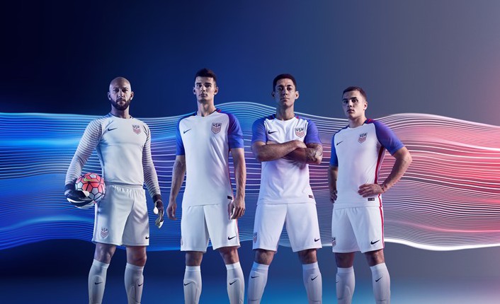
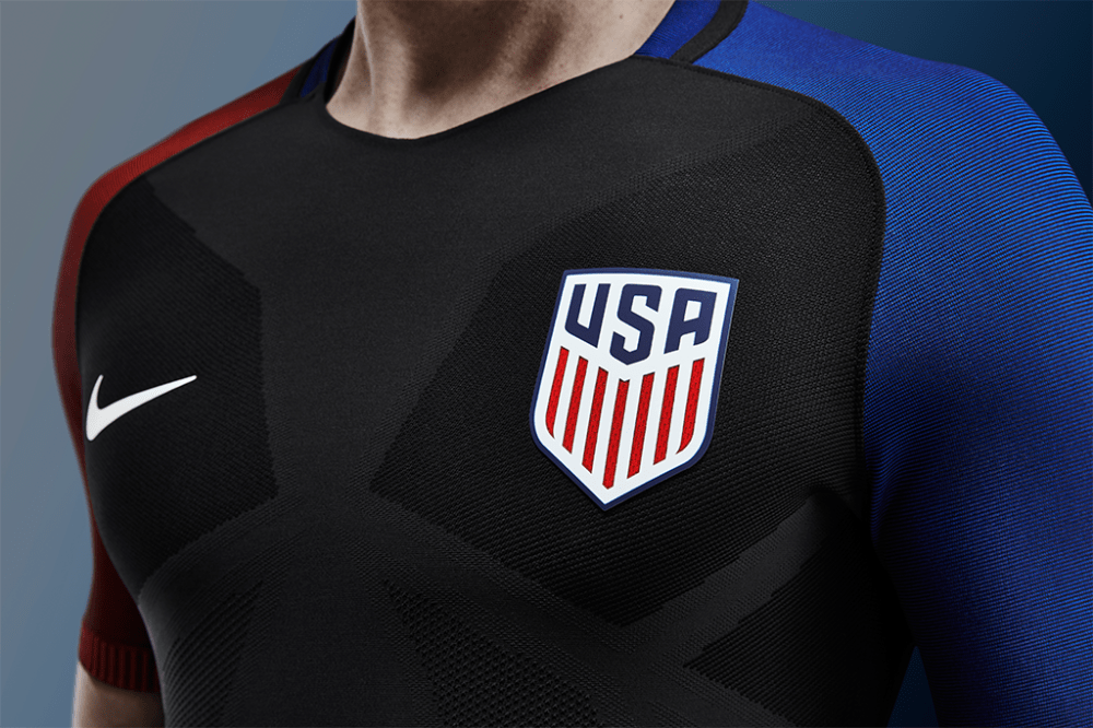
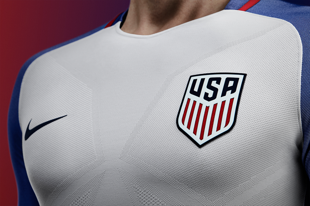
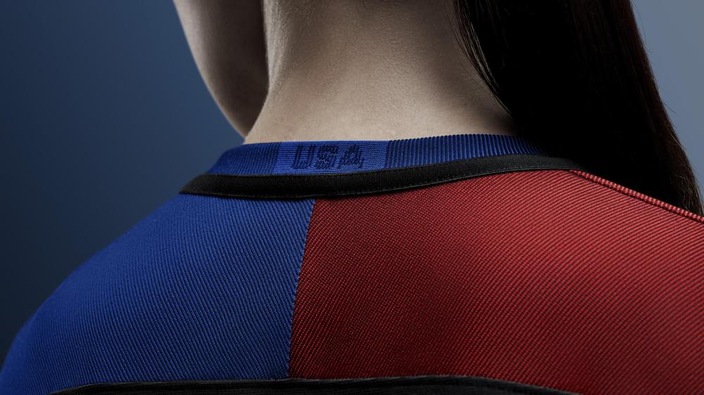
While most U.S. shirts in the past have followed very different designs between the home and away kits, the federation has chosen to go with a similar approach for each this time around. The home is white with blue sleeves and the away shirt is black with one blue sleeve and one red.
The men’s team will debut the new kits March 25 in a World Cup qualifier against Guatemala. The women’s team will debut them in a friendly against Colombia on April 6.
Here are more photos of the new jerseys:


—
What do you think of the new kits? Excited to see them on the field?
Share your thoughts below.
Does anyone know when the kit numbers will come out? I want to buy the Jordan Morris #8, but with Dempsey back in the picture, I am not sure what number he will wear…. anyone have any idea?
Won’t the cape slow them down?
What is with the pectoral compression packets? What does that texture add?
Yes… make them black. So many fond memories of black Jerseys in our recent gold cup finals… Way to go NIKE! ! !
Not to mention it’s the same template as everyone else with nike, Odlly enough you look at Brazil’s or Croatia’s and it always feels like them. These don’t feel like us because even the white kit has a new tint of Blue! I would have been mildly happier if it was all white… but now we have a completely new shade of blue to get used to.
I know this is an off year (meaning no WC) but still… it’s so lazy to make one template for like 15 federations. and the worst part is Nike is an american brand! They should be looking out for us! Not giving us a black kit like our neighbors down south…
f-ing No. Awful.
I don’t hate ’em. I like them better than the bombpops. Less than the waldos and ce tennials, but they’re not that bad.
I liked it before they started uni sexing everything clothes.. last world cup aways see the best then the centennial created white one next. I do agree it should have a more original scheme and not the same ones as other country’s for peetes sake. Nike does the sickest uniforms in sports but I am sure marketing at Usmnt must be running thin with all the arrests tehehe. Do better next year bike until 2016 away out forever on me back
Is that neoprene?
It looks like they hired someone from Marvel Comics to design these…
The black ones actually look kinda badass. The white ones though, they look like something you might find in the kids section at a department store lol.
The promo photos look great, especially with the streaking effect of the colors. But without this, they would look plan and understated.
I was a fan of this all black kit: http://ahelms.com/images/ldpoland.jpg , but the red and blue sleeves just looks tacky.
These jerseys look good in my opinion. Most people here are a bunch of complainers when it comes to jerseys. Actually when it comes to everything soccer image related. I haven’t seen one thing on this website where the majority of the SBI posters didn’t complain about. New MLS logo and crest, specific MLS team jerseys and new crests, SBI’s new website template, MLS’ new website template, the new USMNT crest, the now old bomp bop Usmnt jerseys, etc. Just a bunch of whining about all of them. Maybe one day the majority of you will actually like something? Or maybe its just one of those things where the only people that bother to comment are the ones that don’t like it, and the ones that do like it don’t comment.
This comment has no business being in this thread. It doesn’t even mention all the complaining every time Donovan’s name is mentioned.
The color black has no business being on our jerseys. None.
not a fan. better than the white collared one from the WC though.
still think these are the only three jerseys needed:
home – Centennial white
away – copa america ’07 pinstripe
alternate – ’08 charcoal away
Dear Nike,
I’ve figured it out…
Take your black kit and modify it to 3 different kits:
Home- white with red and blue sleeves
Away- blue (deep true American flag blue) with red and white sleeves
Alternate- red (bold simple red) with blue and white sleeves
There it is….. 3 kits, unique but CONSISTENT visually(ahem, establish, ahem, tradition of our own), all three distinct US colors are involved in each kit.
Now was it that hard?…
Having two different colored sleeves is the worst part of the kit. Its like a 5 year old being allowed to dress himself for church on Sunday and wearing two different shoes and a brown belt with black pants.
Well obviously the best answer is to come up with new awesome jerseys that meet all the criteria. But seeing how Nike can’t do that, I’m just trying to suggest the smallest change that could appease the most. All 3 colors, bold and different, and not black.
Perfect. Exactly like England (http://is.gd/0mJyO5) and France (http://is.gd/Gcnqmd), not to mention all the other countries using the same boring template. Way to go Nike!
Reminds me of the 2002 World Cup or Euro 2004, where every Nike kit had the exact same template…
Check them all out. http://news.nike.com/news/2016-football-federation-kits
Meant to be a reply to Galxian. So many of the Nike kits would be perfect for the USMNT. I guess other teams get first choice. Thanks for the link.
While I actually liked the design, this is extremely annoying. Especially as a fan of the french, whose well-executed jerseys are often at once original and simple.
And you might say to yourself, Why is THAT? It’s because the USSF has little to do with the design of the USMNT jersey with the exception of giving the OK to whatever design NIKE wants to use. Nike wants to make money and by limiting designs and color combo’s, the can easily make fewer “build” runs for the jerseys in China or whatever third world country they are made in, this lowering costs and increasing profits. “One design fits all”
Why do we accept this? It’s because the USSF “gave away” the rights to the USSF design process in it’s corporate sponsorship with Nike.This is not endemic to the US, many countries have the same deal., ie England, France, Germany. Some equipment/kit sponsors may allow more input, but they want control over the design as it;’s a key factor in the cost of the jersey and of course the profit for the company.
So, until we get people on the USSF board that will have the cajones to actually have some control over the Kit selection we will continue to get theses awful “generic” jerseys. Compound the fact that the “red,white and blue” is a common flag/national color combo and what you see is the best you will ever get.
Depressing, but I can’t argue with your logic.
What’s with the “butterfly wings” texturing on the front of the jerseys? It looks like it’s meant to enhance your pecs, but I’m not sure that’s a good look for many men. And some people will question whether it’s in good taste for the women’s jersey.
I don’t care what they look like. They don’t produce wins or results. I wouldn’t care if they were wearing pink freaking pink tutu’s if it means they were going to win something.
What do you mean, they don’t produce results? The US won the freaking World Cup last year.
They’re pretty OK. The better they play wearing them, the more I will like them. They have a stellar Copa and pretty soon they’ll be freaking iconic. It helps to start w/ a classic, solid design, but in sporting “branding”; logos, badges, uniforms, naming, it is tradition…. substance that makes style.
Although I mostly agree with you, when I watch highlights of USA in ’94, I still cringe at the uniforms.
I can not argue. However… my point is kinda pointing at the fact that’d we won the WC we’d be looking at the denims with much more nostalgia than regret.
I don’t line the black away jersey. Our colors are red, white, and blue. Base the away jersey on bloke or red.
The jersey has red white and blue. The crest is white, the nike sign is white, and the player numbers will probably be white. It is red, white and blue, but with a lot of black mixed in for added style.
The black jerseys are ridiculous… Seems like a no-brainer that the main color should be one found in our flag
Nope, not a no brainer, just your opinion, which is fine. In my opinion, the Usmnt is wearing a uniform, not the country’s flag. It can look like the flag or not look like the flag.
I’m a UCLA grad. There are people that got all mad when the basketball team wore black jerseys instead of the traditional colors, citing tradition and blah blah blah, but most people did not care about that. The Ucla players certainly wanted the black jerseys. The University of Oregon has become a college football power partially because high school kids love their uniform variations and think it is cool. Nothing wrong with mixing it up.
a no-brainer? maybe not. i cant imagine italy, holland, or ireland wearing anything other than what they wear.
what’s wrong with changing it up? i loved those old german forest-green alternatives.
It should be unconstitutional to use a color on the kit that ISN’T on the flag.
I like them. Simple yet bold.
the goalie jersey is sick!
The goalkeeper one is okay..
The rest..yikes!
those kinda suck