
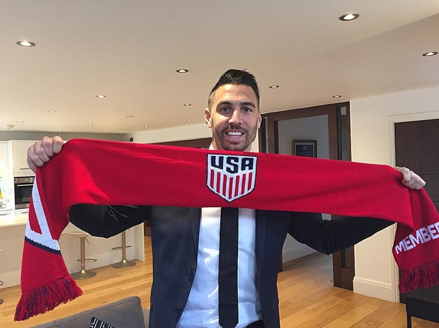
The new minimalist crest revealed by U.S. Soccer caused quite the discussion and debate on Monday.
The U.S. federation unveiled its new logo, replacing the one that has been in use since 1995.
“This design embodies the spirit of U.S. Soccer, but it also transcends our teams and the game. It’s uniquely and unmistakably American,” the federation said in a release on Monday.
The crest features 13 vertical stripes — seven red and six white — under “USA” in dark blue.
“Notably, the new identity no longer features stars or a ball. In soccer tradition, stars are placed above the logo to represent World Cup victories,” U.S. Soccer said in the release. “The (U.S. Women’s National Team’s) crest will prominently feature the three stars earned in 1991, 1999 and most recently, the historic 2015 victory.”
Most critics of the new logo argue it does not distinctly represent U.S. soccer teams because it is too generic. The minimalist design could serve to represent any U.S. team playing in an international competition, whether that be the U.S. basketball team or the U.S. hockey team.
However, those who do like the change feel the crest has adapted to the modern era of design. MLS similarly abandoned its old logo with a soccer ball from the 1990s a year ago, choosing a more sleek, minimalist design. U.S. Soccer has followed suit in removing the ball and stars, the latter of which the federation says it removed due to “soccer tradition.”
With all that in mind, SBI wants to know: what do you think of the new U.S. Soccer logo?
Cast your vote here, and feel free to share your thoughts on the new logo in the comments section below.
[polldaddy poll=9329471]
Wow.
I’m not going to lie, I hate this thing so much that I just assumed it was pretty much universally hated.
I guess I’m wrong.
Or you guys all have really crappy taste in crests.
*could not discern
The previous crest was fine. It had a lot of things going for it. There are stars in our flag so it’s not that weird to have them in our crest. I dont get why people could discern between stars in the crest and also a star for each world cup win. DC has stars, MLS has stars… New crest is pretty blah.
So,…take a look at the examples Steven Goff provides in his article. Compared to these,…the new USA crest in downright simple and plain. Check it out. My favorite is Ivory Coast,…the elephants! How could we have missed including a bald eagle.
https://www.washingtonpost.com/news/soccer-insider/wp/2016/03/01/what-are-the-best-national-soccer-crests-in-the-world/
I’m curious to see if the new jerseys will have minimal design.
It’s Nike so it will be over the top ugly.
It’s like Nike and Adidas have an agreement, Nike will make horribly ugly soccer jerseys and adidas will make the horribly ugly basketball jerseys.
I personally liked the Centennial crest the best. This kind of mimics it, but I like the old school crest the best. I wish they would find a jersey style and stick to it. Instead of completely redesigning the national team jerseys, do variations on a red, white and blue theme. We need an iconic design that everyone knows is the USMNT.
Here you go:
1. Crest with some elegant design including a bald eagle clutching a soccer ball.
2. Home jersey — red vertical stripes circa ’94 World Cup
3. Away jersey — navy blue shirt, shorts and sox — 1995 away jersey
There you go. Very simple.
U – G – L – Y …you aint got no alibi. You UGLY….You UGLY!
There needs to be another option…Would you have loved the Centennial crest….
The crest is equivalent to our team: not great, but not bad.
Why is the first thing I think is OLYMPICS when I see the logo? US SKIING, or something?
It’s alright. An improvement over the old one. I just don’t think the design will scale well. It also feels a bit too tall. I won’t loose too much sleep over it.
How about a badass-looking eagle?
i’ll take a badass-looking eagle!
THANK YOU,…Josh! Where is our national symbol? A bad ass bald eagle clutching a soccer ball in its talons (where is Napoleon Dynamite when you need him!) would be awesome.
Either the mooks they hired to design this just mailed it in or there is some sort of cost involved,…like it is easier and cheaper to mass produce this lame a$$ crest vs. something that is more artistic and complex.
Where is the Bad-Ass Bald Eagle clutching a soccer ball in one talon, and a “Europe Sucks” proclamation in the other!! And also, maybe, a crown of fire that kind of levitates over his head…maybe a hint of laser eyes too. USA Eagle Crest will be awesome
My biggest complaint isn’t that there is no soccer ball (in fact i like that there’s no soccer ball). My biggest complaint is that this logo looks like it was designed for today using today’s design trends (flat, minimalist design), but will need to be redesigned again in about 10 years when the design trends drastically change again and it then looks outdated. the design should’ve been made with scalability and time in mind. something where 20 years from now we have an identifiable logo that is symbolic with USA. think england, brazil and our Centennial crest.
There had better be a good reason why they couldn’t use the centennial crest. I have read varying accounts — that they can’t use it (and just temporarily borrowed it) because it’s owned by somebody else, or they didn’t want to use it because it’s in the public domain and therefore not a protectable source of income. If it’s the former, then why not buy the rights? If it’s the latter, then I guess greed > tradition at USSF. Maybe some enterprising SBI reader could start manufacturing jerseys with the centennial crest.
The former is what I was very specifically told, in person, by a high ranking US Soccer official right before the World Cup in 2014. Now I can’t say I wasn’t lied to but it seems unlikely they’d lie right to my face like that, the people I was with are good people.
It will never accurately represent the USNT until it mentions Germany somehow. Maybe even Mexico.
Looks too much like a 1960s retro to me.
I understand that stars are traditionally used to represent WC victories but since they are so much a part of our flag and so closely associated the stripes I think they should be included. Perhaps upon our impending WC victory the star and could be delineated somehow.
Bottom line is any US logo needs starts and stripes.
its not confusing at all, WC stars etc. arent on the actual badge. List of countries with stars on their flags and badges that isnt confusing to the people who say it was an issue for the US badge: Algeria, North Korea/DPRK, Israel, Djibouti, Liberia, Jordan, Micronesia, Somalia, Azerbaijan, Puerto Rico, (I could go on but you get the point)
This star thing being confusing is real, its people making an issue on the internet to make an issue on the internet.
I believe the fact that the letter S is larger than the other letters denotes S for “Soccer.” Still not a good crest though.
I think it means “States”
Better question: Will the USMNT appear in a World Cup final wearing this crest?
Guessing this gets changed within the next 10 years.. 3 world cups..possible but unlikely
I would have rather seen the crest we used for the centennial stick around. This one looks like the generic version of that one. All in all, its okay… Not awesome, but Okay.
The 3 stars on the USWNT crest really adds a lot to it, the USMNT version is very boring.
Perhaps our Men should win three world cups then…..
Where is the option: Good but not as good as the centennial?
Intuitively that would be the “it’s ok” choice….
I find it ironic that so many people hated the old crest for the flying soccer ball, but the biggest criticism of the new one is that there’s nothing that makes it distinctively a soccer crest.
it doesn’t scream soccer crest, it can be interchangeable with any US sports team. It would have been a good Team USA olympic crest, just not easily identifiable as soccer. A collective Meh is true. Apparently the black jersey looks better in person, but my source is a bit biased considering his employment.
Judging from the poll, USSF did perfect in this day and age. Low on the love and hate. Mostly half hearted thumbs ups and mehs. We created this world. F*CK!