By AARON CRANFORD
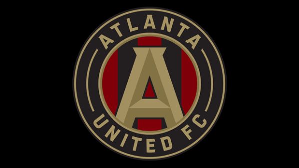
Set to enter the MLS fray in 2017, Atlanta United FC announced its new logo Tuesday night.
As part of a celebration for the team and a viewing party for the U.S. Men’s National Team match against Honduras in the 2015 Gold Cup, Atlanta United presented its new logo to more than 4,000 people in attendance.
The team’s colors of gold, red and black all prominently feature in the logo, and the circular design draws from Atlanta’s city seal, and like it’s name, the shape stands for unity.
“It’s a strong logo,”Atlanta United owner Arthur Blank told the Atlanta Journal Constitution. “It represents Atlanta, which is what we wanted to pitch. It’s very compatible with other logos you might see in soccer, nationally and internationally.”
Check out the club’s official announcement of the logo below:
What do you think of the new logo? Think the design suits the city of Atlanta?
Share your thoughts below.

