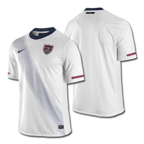
The U.S. men's national team's home jersey for the 2010 World Cup was unveiled this morning. Here it is.
What do you think of the jersey? Like it? Miss the old one? Already ordered it?
Share your thoughts below.
The U.S. men's national team's home jersey for the 2010 World Cup was unveiled this morning. Here it is.
What do you think of the jersey? Like it? Miss the old one? Already ordered it?
Share your thoughts below.
I like it. I think the important thing here is that on the internet, people will complain about anything and everything
I hope we never do a 94 throwback O_o
You know, I have NOT heard that one before. I’m glad we have you around for those kneeslappers.
you’re lame…
spot on MrDot
I totally agree, the 2006 white with the stripe in red is much better.
a red sash would kinda be absurd though, it would look way to beauty pageant looking
And good job to your sarcasm as well.
“buy a new jersey every two years” this, of course, is the reason it’s done.
For all the ‘should be red stripe on white’ people… that would hardly be a good way to laud a victory over england, given their flag (st. george) is red stripes on white… and no, the union jack is not the english flag, it’s the united kingdom flag.
well the idea is that they wanted to keep it all white, the classic look, but also wanted to keep the same design as the blue one with the white sash. that jersey is going to look really cool with the white shorts and white socks. especially with the players wearing white cleats
I HATE the new kit too. Beauty pageant, crossing guards, etc. Doesn’t inspire pride at all. I know the sash isn’t random, but that doesn’t mean it looks good.
BTW, you know who did the throwback right? England.
the white jersey rules. they better wear it with white shorts and white socks. its way better than the blue one, but that one is ok. those blue warmup jackets are great.
love it.
hence, the home kit advantage! it has nothing to do with the crowd, grass, stadium, etc
Not nearly as fearsome as they want it to be, to be honest…Clint is a great player, but his “looking mad” schtick is blah.
then the USSF they should consider hiring a real coach.
Yeah, I see hardly any similarity between the two. 1950’s sash was red, first of all.
Second, if they had beaten England 1-0 in pink leotards in 1950, that doesn’t mean I’d like them to wear pink leotards in 2010.
The win was nice….the jerseys were not so sharp.
its aight…
IMO…would be better with a red or blue sash or combination of the two.
Is anyone sick of the all white color scheme?
Wow….
It’s close to a “throwback” only in that there was a diagonal line across the chest of those shirts. They certainly weren’t white (or light grey) on white, and the angle was different.
New jerseys come out every two years. Some teams stagger their jerseys release and have a jersey out every year overlapping the “old” jersey for a year. Typically though, most clubs and national teams get new jerseys every two years. I personally don’t mind this as it is fun to buy a new jersey every two years to add to the collection of your favorite club or national team.
Agreed.
Also, this jersey is too . . . white. Not as bad as the All-England Tennis Club faux-class of the underdeveloped England shirt, but still too understated. Less is more only if well executed. It needs more red and blue. Shouldn’t have been difficult.
I give it a “B.” It’s ok, but I really wish the sash was red.
As for a potential red third jersey, I don’t think the only thing circulating on the web was a mock-up done by a MNT fan. There’s a site that produced leaked photos of three jerseys, two of which have proved to be spot on. I think there’s still a chance we may see a red jersey, but it probably won’t be unveiled until late in May, perhaps for the Turkey game, which is our final home game before heading to SA. US Soccer unveiled the 2006 red jersey against Latvia in the final send off match before the Germany WC. We also have a tune up match in SA against Australia in June, so perhaps there we could see it.
The funny part is that there’s much more tradition behind the white shirt. Through all the years and changes, the USA soccer team has always had a white home shirt. Also, white is the traditional racing color for American teams.
The fact that first Sam’s Army and then all subsequent US supporters chose to wear a color based on a one-off away jersey in 1998 has always completely baffled me. We are always complaining about a lack of tradition, but here’s one right under our noses.
i am sick of a new jersey coming out every year. I am sick of it for club teams and sick of it for national teams.
No red jerseys, but US Soccer is selling hoodies that are red with the sash (and the “don’t tread on me snake”). http://ussoccerstore.com/us00m273110ca.html
I think they look okay.
I am still partial to the anthracite (dark greyish/blue) jerseys with the “number/circle” on the chest. When were those? 2004?
Tell them to join American Outlaws and they will receive a free RED AO shirt with their membership.
Maybe they are honoring all those faded flags that you still see on cars and stuff from 9/11.
Great shirt. In my opinion, it balances perfectly between too busy and too boring. I will likely sell my soul to the USMNT and get both jerseys, as well as the red training top. Expensive, I know, but our team is worth it.
They should have made the two thin stripes on either side of the sash red. It looks too plain, like a black and white version of what the jersey should look like…
still looks like an undershirt.
Not sure if you’re aware but this is a throwback to the 1950 kit when we beat England. It’s not like they just decided to use the sash out of nowhere.
Anybody know what # Jozy’s wearing @ the WC? I’d like to get the same # but it seems forever changing …
The Stripe should be red like on our flag…it’s a no brainer. Not a bad looking jersey, but the stripe should be red…no doubt about it.
+1 That is what I picked up. As for the jersey, I would prefer the blue (and hoped for the red).
The idea that no other countries switch designs is a fallacy. Look up Germany’s or England’s designs since 1994.
Looks good. Nice throw back to the one they beat England with. I hope they use this one with the white shorts/socks. I like it better than with the blue shorts. Plus it helps with the teams identity. Those who aren’t too familiar with the U.S. team will remember the Confederations Cup team, I think they used the all white kits throughout the tournament.
mint jersey, big fan
I hate it, looks like they are wearing a sash, here they come miss americaaaaa!!!!
I have had this jersey (No. 10 Donovan) for over a month. Never buy a jersey unless you get it from E-Bay. $39 with shipping, straight from the Nike Sweatshops in Asia
Meh. Should have had a Blue or Red strip. Grey strip on white is weak. I might get a road kit, but this is kinda weak sauce.
The red one is perfect for Trinidad & Tobago.
No, I mean authentic ones.
pretty bland
yes we do his name is jozy altidore!
HATE the new kit. They look like crossing guards.
I prefer the ’94 WC home kit. The stars and sky blue…Eric Wynalda….Alexi Lalas and his goatee….
I seriously, seriously just want them to PICK ONE DESIGN already.
Are we the only team in the world that switches jerseys all the time? What’s our identity with it? Ugh.
The Joe G story is a sad one. We should find a way to honor him. Especially considering the movie they made about that team, “game of their lives” (or something like that) portrayed him as a darked skin voodoo preist/busboy. Joe G was actually a light skinned Catholic and college educated. SI had a write up about him a few weeks back. shortly after the 1950 WC he was kidnapped and seemingly assainated by a Haitian military junta
I agree. There’s not enough contrast. Definitely like the navy better.