
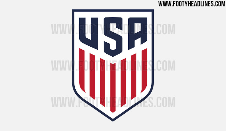
A long-standing criticism plenty of fans have had about U.S. Soccer over the years is the design of its crest, but the current look might soon hit its expiration date.
U.S. Soccer will unveil a new crest next year and a report from FootyHeadlines.com suggests it will look somewhat similar to the centennial crest that earned rave reviews back in 2013.
The new crest will be a blend of sorts of the current one and the one used to celebrate 100 years of U.S. Soccer. It will reportedly include the 13 vertical lines, seven red and six white, that were on the centennial one and boast the words USA on top of that instead of the soccer ball and “U.S.” that occupies the current one. The shades of blue and red are also a bit darker.
It remains to be seen if this crest replaces the current one, but U.S. Soccer had been contemplating a change after seeing the overall positive responses to the centennial crest. The current crest has been with the U.S., more or less, since 1993, and is constantly criticized.
U.S. Soccer has yet to address the latest reports, and a call seeking comment has yet to be returned.
What do you think about the proposed U.S. Soccer crest? Do you like it? Prefer the current one?
Share your thoughts below.
Yes. Way too generic but why did everyone love the centennial logo? It was ugly and plain and had no soccer reference. It also looked like a ripoff olympic logo.
Nike must be using asian designers who have no idea about: 1-iconic US symbols, 2-soccer tradition.
the biggest culprit will be US soccer president Gulati for accepting a 3rd grade-looking design from Nike..
“Nike must be using asian designers who have no idea about: 1-iconic US symbols, 2-soccer tradition.”
Asians know nothing about Americans sporting culture or tradition. That is why 98% of everything you see in Wal Mart or any other sporting equipment retailer is made in Asia.
i Like it… only because its still better that the current crest… would have loved the centenial crest to be the official one but i’ll settle with this one as long as ITS NOT THE LAME CURRENT ONE
It needs an American Bald Eagle perched on top, clutching a soccer ball in its talons.
why can’t they just use the centennial crest? one of the only things i’ve seen a large majority of US fans agree on when it comes to jersey-related items.
trying to reinvent the wheel when they have a perfect logo already.
nice but how about this?
http://boards.sportslogos.net/topic/94185-time-for-a-usmnt-concept/
i think if we add stars to the logo, it has to be 13 so it is CLEAR that it represents the colonies and not WC titles.
Wow! WTH? It’s obvious these people are way over-thinking this. They are trying too hard. It looks like their influences come from the Transformers series of cheeseball movies, power rangers, and stuff from the metal gear solid series of video games. common now! Are they too proud to use the centennial crest as a permanent option?
Meh. The centennial crest is classier.
This one is just dull and why the Marvel superhero angles on the crest?
I don’t think US Soccer will be able to use this. This is the crest the knock-off apparel companies use during the World Cup. I saw this on a jersey in Walgreens last World Cup. Knock-offs had it first.
Where is the corny symbolism or kickstand that MLS brought in? I assume it’s the same design firm getting paid boatloads of cash to come up with simple 10 min design.
This is okay enough, But both the Centennial and Gasden DTOM USSF logo are better. Anyone know why they can’t use those?
You’ve got to be f**king kidding me. Jesus Christ. New way. Terrible. I feel like vomiting.
For the love of God, change it to the centennial crest. What the hell is US Soccer thinking? Putrid. Hideous. Foul. Horrible. Ugly.
What intern designed this? Did he get a B+ for his community college class?
Boring….
Stitching all the suggestions together. Lets have a bald eagle with a centennial crest at its breast like a shield and holding a soccer ball in its talons.
Just like great seal. One ball per talon. The stars in the seal are replaced by stars for all the WC wins we’re going to rack up some day.
https://upload.wikimedia.org/wikipedia/commons/thumb/5/5b/Greater_coat_of_arms_of_the_United_States.svg/2000px-Greater_coat_of_arms_of_the_United_States.svg.png
It looks like it was drawn up by a third grader or else Bane decided to get patriotic and donated the rights to his mask.
Too plain.
Should have an Eagle as part of the crest.
A modified Atletico Madrid badge is closer to correct. Stars, stripes, and red white and blue. A non-cartoonish play on the Great Seal could be just as good and similarly evoke soccer tradition. But this could be the badge for the USA bobsled team. Huge missed opportunity.
A little bland, but a bazillion miles better than the current crest.
Perfect for the US ski team.
Meh. I was never a current crest hater. This one is not a vast improvement IMO.
Nike, where you at? Where is the “Volt Yellow” and Black?
Would look better with some stars on it, like the German crest or Brazilian crest (or, ahem, the USWNT crest).
Good but should also have a picture of Donald Trump on it.
Any news on the chicharito rumor.
Who’s the team willing to pay $10 million a year?
I think we might be surprised, I say red bull, skc, Houston, Dallas, or even Montreal.
Imagine nyc and lampard lower their salary, then get chicharito.
Any news, he only has till 5pm eastern time.
I say its between skc and Houston or Dallas or rsl.
The centennial crest is better, but this one will do. As for its “generic” appearance, how about using “USSF” instead of “USA”? Don’t some other nations’ crests do that?
On the other hand, an eagle has obvious appeal. How about an eagle perched on a soccer ball?
Most other crests do it. It’s supposed to be a representation of the federation.
Way too generic. The Centennial Crest is the way to go, IMHO.
Clean, modern with no real traditional elements other than the shield shape. It’s very similar to what MLS did with their new shield (it uses a German typeface DINschrift.)
Both can be successful but the centennial crest is still much stronger from a design standpoint. This one lacks stars and while that may not be an absolute need US Soccer does represent the stars and strips or “las barras y estrellas.” There has to be a more creative way to keep those elements as a holdover from the old designs.
Should somehow incorporate “Don’t Treadl on Me” snake…
http://shaneparkermcmahon.com/wp-content/uploads/2013/03/US-Soccer-DTOM.gif
The best recommendation on design I have seen. Don’t tread on me!
Yes!
This or the Centennial, you don’t need to pay some design firm to recreate two iconic symbols of US Soccer that have hardly been used.
This is an okay third place design compared to the DTOM or Centennial
Sorry, I like the current one WAY, WAY more.
Maybe add ten stars?
Like in a 3-6-1?
🙂
Any US logo should be a derivative of the Great Seal of the US. An eagle holding something.
Exactly, as long as it not cartoonish.
I agree. In fact, why not have it be the eagle holding the arrows and the olive branches with a little variation?
BTW – We can’t have the eagle just holding “something.” It is very iconic and meaningful that the eagle holds the arrows in one claw and the olive branch in the other.
VSA Cowcatchers!
Super bland and generic. In fact I’d rather keep the old crest than use this version. If I didn’t know any better I would have thought this was an Olympic team crest. Just use the centennial crest and move on with it.
Agreed, with red eye. It’s missing an eagle somewhere.
And seriously, 7 stripes?
What happened to Symbolism?
13 stripes.
Put the iconic American eagle at least.
This looks so mls style, even the most third world countries with soccer have better soccer crest.
Thank you! Where is the bald eagle? I cannot believe these boobs cannot figure this out.
Iconic? Like the eagle on the Mexican crest? Or the German crest? Or DC United? Or Nigeria’s?
To me, it’s not clear it’s the crest of US Soccer. People on the streets will just think it’s related to any US Olympic sports team….basketball…track and field…etc…
need a ball somewhere…not the shooting-rocket-ball though.
Simple. I like it.
Certainly this is better than the current one. I love the centennial one, but if they are set on not reusing it, this is a good way to go.
Anyone else think the font makes the “u” look too much like a “v” though?
Yes. VSA : Vereinigte Staaten von Amerika!
I DONT LIKE THIS CRES LOOK LIKE PROGPOGANDA FROM THE WAR
Whiny Pinko Commi!!
You can’t talk to FRANK like that.
WHY?
Seriously. What’s your deal? Have a little respect
Whats your deal? Let Frank speak for himself. Pansys!
My only complaint and it’s a very, very minor one is that the USA font is too similar to the font used on the front of the USA Basketball jerseys. Not a big deal. Certainly not a deal breaker but I wish there’s was a little more distinction. Nonetheless, I love the simplistic and clean look of this crest.
Simple and classy, but the Centennial is better. This will do though, I definitely wouldn’t be mad if this was the new crest.
Like it a lot, but still think you want a connection to the sport…so it doesnt just appear generic USA. I would prefer a small ball worked into the bottom point somewhere.
I utterly disagree. I hate having a ball. To me it shows the American ineptness about soccer. When you see classic crests (Argentina, Brazil, German, Italy, France, etc.) they don’t have balls but you know at a glance what country they are. Perhaps USSF across the top instead of USA. I think it needs to be obvious that it is the United States national team in soccer. And it should not have a ball like a youth soccer organization would. I hope they get this right.
We are not Argentina, Brazil, Germany, Italy, France. Our national team is irrelevant in our own country – when I wear my country’s gear in public I want people to know that I’m supporting our football team – a fact that will be completely lost on 90% of people who see this new crest.
This looks like a crest slapped on a $5 knockoff jersey. So generic. Not sure what the answer is, but this attempt is horrible.
I don’t mind the current crest, it’s so bad that it’s around the bend in to classic and serves as a reminder for how far the team has come. The old MLS logo bothered me more.
Also I’ve always been partial to http://imageshack.com/f/824/ussoccerupdateipadvinta.png
+1 to Rees. He is correct IMO.
Start by calling it soccer.
FIGC (Italy) is a soccer reference and there actually is a soccer ball if you look close.
FFF (France) is a soccer reference and there is a stylized soccer ball incorporated into the nationalistic rooster symbol.
AFA is by definition a soccer reference and there are plant accents.
CBF is again a soccer reference, and the logo while incorporating Brazilian colors is not just a flag steal, the design is unique.
DFB (Germany) is a soccer reference and there is a bird on the logo.
So, you’re not even right on all the “classic” logos, and they usually depart from the flag and either have a more elaborate design, a soccer ball, or at least an identifying animal or logo. The stripes are almost anti-logo. As with some recent MLS efforts, there is nothing “logo” there. Not just no soccer ball. No lions. No birds. No red devils. Too generic, people might think it looks ok for a few years because it’s not hopeless, but I give it 5 years before people are begging for the more interesting centennial or a soccer ball or eagle or something interesting. Yawn.
I’m definitely a fan of this crest, but the 13 stars from the centennial crest were pretty cool, I wonder if they could incorporate that in as well. Some sort of combination of the 1930 and 1950 crests would be look pretty nice in my opinion.
Simplicity is good. We don’t want to have to redesign this again in 25 years. I think this could stand the test of time. Love it.
It doesn’t get much simpler, that’s for sure.
It needs a soccer ball swooshing through.
But would there still be room for the 7 (???) stripes that of course symbolize the new 7 year deal Nike will sign with the USMNT?
Uh Rory, there are 13 stripes there. Think flag.
A step in the right direction. But, could use a little bit more personality.
Yep. Like uncle Sam giving everyone the bird.
I kind of wish we just bought the NE Revolution logo (still my all-time favorite non-traditional crest)
That would be cool. It’s a great soccer logo.
Better than what we got but I still don’t see why we don’t use the Centennial Crest.
I love this crest. Not as much as the Centennial crest, but it’s pretty awesome.
Bro, I possibly couldn’t DISAGREE with you more. I absolutely HATE it. It reminds me of everything that I do not like about the font of our national basketball teams.
I’m glad that there are no stars. I’d prefer that we just keep the current one but minus the stars…
Can’t agree w/ you more. It’s blocky, chunky, too thick. Don’t like it at all.
The stars are what you don’t like about the current crest?! Seriously?
Of all the things that are ridiculous about U.S. Soccer’s current crest, you pick the stars? How about the fact that the stripes are blue and the stars are on a red background? How about the 1990s clip art of the flying soccer ball? The current crest is a dated disaster.
I could nitpick the new one a little but the old one is just plain awful all the way around. Removing the stars would do nothing. This would be a dramatic improvement even if not perfect.
Centennial is better though.
Definitely NO STARS. Need to earn them. i.e. USWNT.
Earned stars go over the crest…nothing wrong with stars in a crest…plenty of crests around the world have stars.
Current crest is obviously not all that mind you.
The current one is garbage. The current one has always been garbage.
C’mon that’s not true, we all dug it during the 94 World Cup!
The current one didn’t exist in 1994. It debuted in 1995.
Hmmmmm. Might be a little too plain. Does not say a lot about US Soccer tradition. (yes we do have some). Not very iconic or intimidating.
Yeah, so it turns out I do want a soccer ball in the emblem.
This looks like one of those generic Olympic team shirts they sell at the dollar store once ever four years.
Yeah so it turns out I Do want a soccer ball in the crest somewhere.
This looks like a Dollar Store knockoff of the latest US Olympic team gear.
Yeah, so it ALSO turns out my phone does weird things when posting. Apologies.
The logo is at once too generic — no soccer reference — and too specific — it feels like a Nike USA logo I’ve seen some of the Olympic teams use. I’d prefer soccer specific and timeless and brandless.
Not all team logos have soccer specific references.
For example, Bayern Munich and the Seattle Sounders do not.
Arsenal only has a cannon and Roma has a Wolf and Romulus and Remus and 1927. Lazio has an Eagle.