The MLS Expansion team in Philadelphia finally has a name.
Major League Soccer's 16th team will be named the Philadelphia Union, the Philadelphia Inquirer reported on Friday. Union beat out four other proposed nicknames, including AC Philadelphia and Philadelphia City.
For those who recall, SBI's informal poll on choosing a Philadelphia nickname back in January drew more than 3,800 votes and saw Philadelphia City (30 percent) edge out both AC Philadelphia (27 percent) and Philadelphia Union (26 percent).
Philadelphia Union will officially unveil its new team name, logo and colors on Monday at a ceremony at Philadelphia City Hall.
My initial thoughts? The logo and colors are great and while I wasn't a fan of Union out of the four finalists, I don't think it's terrible. I also like the idea of the team informally adopting "The Snakes" as a nickname.
What do you think of the name? Should Philly have gone with AC or SC? Like the logo? Just glad I won't have to run that tired photo of the shovel?
Share your thoughts on Philadelphia's nickname and logo below.
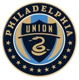
Philly did a really great job with this. The name is appropriately symbolic, unique enough, and sure to inspire many “union” songs. The colors, blue and gold, are the colors on Philadelphia’s flag. The circle badge is reminiscent of Inter Milan without ripping them off and has the benefit of fitting Philadelphia’s long name into it. The snake is pure genius, on its own and particularly as part of the shield within the circle. Well done. Now all they need are some players.
@ Steve T and others:
From the Philadelphia Inquirer:
” . . . the team hearkens to the city’s part in the nation’s founding and to the area’s historic role in the American labor movement.”
Words have many meanings . . .
HAHA, love the comments. Perhaps some of you pro-union guys should try to run a large corporation some day. Believe me, I understand the glorious history of unionization and the labor movement, but this is 2009. Labor unions have become just like the entities they once found it necessary to combat. They are, for lack of a better term, parasitic. In the case of GM and the UAW, the parasite killed the host. Yay, let’s name a soccer team the Union.
At some point, the team is going to attempt to sell luxury boxes to big, evil corporations. Maybe some of those malevolent CEOs would rather spend the cash on the 76ers than have to look at the word “union” all the time. Who knows.
The potential connotations aside, it’s a stupid name. It’s a play on “united” — how original.
I can see the name growing on people. As long as Philly fans dodged another FC, City, or AC I’m happy. I was waiting for the management to completely botch the logo too, but they did a really nice job. Here’s a litmus test to consider: if you think the whole or part (ie. the snake)of the logo would look good on a fitted cap, its a good one.
Looking forward to what the jerseys will look like.
I thought it was a great name, until one wag earlier in the comments linked it to Duran Duran’s “Union of the Snake”. That’s all I’ll think about now!. Hilarious…and painful at the same time.
I really think “sons of ben” would have been a dope nickname. And I don’t think the supporter group would’ve minded
I didn’t know the snake was a marine thing, nevermind, it makes sense to me now
its perfect. Philly was the birthplace of the union, so its only fitting… Thank god they didn’t Kowtow to the corny nicknames like City, or AC Philly, which have no relevance to the cities history, and would only be a cheap attempt to make MLS more European… I’m not sure about the snake to be honest, I love it as a US national team symbol w/ the whole don’t tread on me logo, but It doesn’t necessarily fit w/ the “Union” theme. But that’s a small quarrel I have. Overall, good choice
Like the badge. Name’s not too good, but I’m of the opinion that AC and City would have been downright embarrassing. There were no quality choices, if you ask me…
Wow, name your team after the very thing that ruined Philadelphia. Nice move Philly.
Posted by: Tom | May 08, 2009 at 10:23 AM
Hahaha…class!
Jesus Christ…everyone please reread Ulrich’s post. “Union” has nothing to do with worker’s unions!
Love the badge btw
P.U. = Not Good
Union = Not Bad
Crest = Very Nice!
Hope those SoBs in Philly are happy! 😉
as a sounders fan i don’t really have much to complain about but the zolos are going to have a pretty sweet badge… better than ours for sure and probably the best in the league in my opinion. i hope they wear brown for one of their kits… that would be SO cool, i know many will disagree but what can i say other than you are wrong.
i wouldn’t trade my iconic rave green for anything though, the sounders just need to swap out the blue for dark grey and i’ll be happy.
I think its good, much better than the Red Bulls.
I like it. The name is a little strange, but matching Philadelphia with anything is tough. At least they kept it City focused and not something like Real Salt Lake (Royal? Really? Maybe just for the Elders of the Morman faith).
The Snakes as an informal nickname is pretty cool.
I still think the Sons of Ben should have Wild Turkey as their official tailgate beverage as Ben Franklin was in favor of using the Turkey as the symbol of America instead of the Eagle.
The logo looks great, I wouldve still prefered AC Philadelphia, but, I guess Union is alright too.
Considering that there are currently two unions who are taking a break from fighting with management to sue each other (http://www.usatoday.com/travel/flights/item.aspx?type=blog&ak=66343773.blog), you don’t have to be Karl Rove to be skeptical of the efficacy of labor unions at times. They have done good things and dumb things, just like many other organizations (catholic church comes to mind).
I think you can say ‘union’ without a negative connotation since it’s a sports team you are talking about, but, not everyone feels that way, and there are valid pro/con feelings about them on both sides.
Duran Duran aside, it’s a good name (not a company, Yay!), a good badge, let’s move on to them finishing last in the East in 2010…
I know that I support some clubs with lame names but “Union” is a pretty sorry name.
Seriously. The freaking Philadelphia Soul and Freedom had better names. It sounds too Arena League and Tennis team-ish.
Someplace better than Miami Fusion and San Jose Clash but still subpar.
Logo, while rehashed is way better than that side from Columbus that is temporarily holding on to the MLS title though.
I just think that that those SOB’s deserved better. Oh, well. We all have a lot of time to start thinking of wisecracks…
Hey, They put statues of that fitional character up in the city… They have to deal with it 😉
Love to see them pulling old philadelphia iconography into the team identity (snake and join or die) great stuff in my opinion
the logo is top notch except for the stupid “union” font
the name is pretty “meh” but hey at least the colors arent red and blue right?
Personnaly, I liked “Philadelphia Bros”, you know, city of brotherly love.
Posted by: SF Dave | May 08, 2009 at 12:21 PM
Just need to change the “o” to “a” and then we have a fight on our hands. . . .
as a resident of Philly I’m so EFFING pumped about this team. Great logo design… name? ehh… but who cares. WE HAVE AN MLS TEAM!!!!!!!!!!!!!!!
WTF, no wiki page for this team? get with it ppl, one should already be up explaining the symbolism of hte badge etc… People are paid to do this kinda stuff, get with it
Just glad you won’t have to run that tired photo of the shovel Posted by: elmatador | May 08, 2009 at 11:01 AM
AMEN to that!
I like the logo a lot, and the name would be great if there wasn’t another team named “United” right down I-95.
I would have preferred City better. Union is cool, though. Snakes are pretty awesome and the logo is a nice Euro-style logo with historical connotations. Brownish gold for their jersey’s… something like Club America?
PU is hilarious, I agree.
BCC,
Some people have very positive views of the word “union”. So gfys.
AC = Athletic club. Are they going to have any other teams in other sports? SC = Sports club. Same question. If not competing in other sports those are not valid choices. (I voted for City)
This is a great name with meaning and the logo is cool even if it’s already in use by USMNT. Philly, Boston and maybe even NY are representative cities of the birth of America. They can use whatever colonial/revolutionary symbols they want.
The logo so so. The name horrible and ridiculous
I think the logo and name are both great. Congrats on Philly for doing something a little different from the rest of the league and something with a nod to the city’s history.
Personnaly, I liked “Philadelphia Bros”, you know, city of brotherly love.
Logo: amazing
Name: would be good if there wasn’t a United just down the street.
I like it a lot. And I think it’s great that the logo colors are close enough to the Sons of Ben colors that those guys don’t have to run out and buy all new scarves and gear. In an effort to make more money, the team could have really screwed the Sons of Ben and gone with, like, green and red.
Wow, a lot of people posting on this thread do not have a clue about history of the USA….
Union – represents the forming of the Union between 13 original colonies when they declared their independence from England.
the 13 Stars – the 13 original colonies.
the Snake – from Ben Franklin’s political cartoon Join or Die, that dealt with the importance of colonial unity (unity = union).
Philadelphia was also the first capital of the United States (before moving to DC), so all of these symbols are aptly used since Philly was the epicenter of the new nation.
I liked Athletic from the start, but that is probably as much to do with subconsciously already knowing the name.
Great choice overall. Best of the four. As has been said: A true soccer name that is also distinctly American.
you clowns, stars for championships generally (the general rule, there are a few exceptions) go above the crest! These stars are a completely different symbol. And yes, the 13 stars represent the original 13 colonies, how is it possible that people miss that? And of course we’re not stealing the (reasonably sweet) nike USMNT campaign, the gadsden’s flag and the snake as a symbol of the US were popularized in Philly (the original snake analogy credited to Ben Franklin, look it up). Also, what about the crest makes you think they’re referencing labor unions? I think they’re actually trying to avoid that.
Love it. First class all the way. Philly phans should be proud.
I think Union is a good choice. Too many MLS teams have absolutely wretched names including Real Sal Lake, NY Red Bulls, and FC Dallas. These are very poor attempts at making MLS European-like. Unfortunately we are not European. Be original and be American. If you like the FC or AC theme, then call it SC for “soccer club,” since that is what we call the game over here. Union is a good name because it doesn’t copy another European club, but has a traditional soccer sensibility. My only contention with it is that it is very close to United, but nothing is perfect. City would have also been a good choice.
As a Red Bull fan I am envious. Talk about a team getting it right a year before they’re even supposed to start playing.
We’re ahead by 14 years in NY and are still not getting right.
Damn you Austrian Energy Drink
Too bad they’re not going with Slytherin green.
Hey, aren’t you supposed to earn the stars?
Why would anyone want AC Philadelphia? Do you actually speak Italian? How often do you refer to ‘soccer’ as ‘calcio’? Never? I thought so.
That’s a proper name. But their colors–are they teal and sky blue? Really? Do they not know the dangers of a brown kit?
Boring…
Should have went with something like Philly Freedom.
Had an instant song they could have sang in the stands.
Also, I am pretty sure Philly laid claim to the Gadsden flag 250 years before the USMNT, though the stars are questionable regardless of historical relevance.
Phili Union is ACES.
This logo beats the crap out of some badge with a stupid space needle. And the colors are better (not to mention the fans).
And the stars – we’re just setting our expectations high and expecting we’ll capture 13 trophies in short order.
@ BCC: What negative connotation of the word “union”? Is it the 8-hour work day they brought you, or the 5-day work week? Darn them!
Of course you could be a confederate, then I spose it makes some sense.
Really like it. I think the “Union” name is a pretty clever play on traditional European names with a distinctly Philly/American historical idea. I think Philadelphia Athletic would have been awesome, though, again for the same reasons.
And if you are trying to connect to the blue-collar crowd, probably not the worst name out there, either.
Bob, BCC, I hope you enjoy your 7-year-old’s 14 hour shift in the coal mine this Sunday.
don’t really have much use for a city that boos santa claus and whose two greatest sports heroes are fictional deadbeat boxer anda special teams scrub who made his team as a publicity stunt………..
nice logo… undeserving of such a crappy city.
Actually, both the logo and the name are perfect matches given the history involved. The snake is intended to evoke the Revolutionary War “Don’t Tread on Me” flag, which was known as the First Union Jack. Good job.