
By RYAN TOLMICH
The U.S. Men’s and Women’s National Teams are set for a new away jersey.
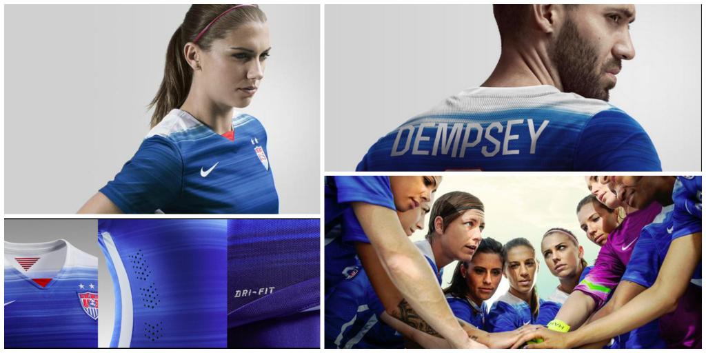
The new-look uniforms began making the rounds on Monday on Twitter. The shirt features a blue gradient pattern with shades of white and a splash of red in the V of the collar.
The new jersey is set to be debuted by the USWNT on March 4 in the Algarve Cup. The men, meanwhile, will likely wear the kit for the first time on March 25 in a friendly against Denmark.
Here is a closer look at the new uniforms:
https://twitter.com/heidiburgett/status/567337648612585472
https://twitter.com/heidiburgett/status/567337891039162368
One Nation. One Team. One Goal. Download @nikesoccer app to preorder the 2015 away kit http://t.co/9DtKsSkjdo #USWNT pic.twitter.com/ZCgSnlUm4H
— U.S. Women's National Soccer Team (@USWNT) February 16, 2015
—-
What do you think of the new uniform? Like it better than last year’s? Disappointed with the look?
Share your thoughts below.
Nike’s uniforms have always been lessor to adidas. They try to make unique designs that just fail. Adidas designs are classic and never look bad. Bummed Nike got in the game in 90’s.
What bothers me the most about the constant changes is that when the US plays the support doesn’t look as strong since the US fans are in 50 different colors/kits. When Brazil plays it is an ocean of yellow…Itallian fans are in Blue, etc.
Very good point. Watch any footage of a US game and the jersey that sticks out in the crowd the most is the hoops jersey. 20,000 people wearing the hoops would be pretty unmistakably American.
Agreed. I wasn’t a fan of the hoops when they first came out, because of the obvious “where’s waldo” connotation, but the fact is, the players looked very distinct, very american, mirroring our flag. Just as important, I can think of no country that wears hoops of any color. That would make us unique, and wherever we went, people would know exactly who we are.
Hmm…new away jersey…Well, makes sense to have it at the Mexico game in San Antonio. It’s practically an away game.
Not being sexist, nor unpatriotic, but I don’t get why the USMNT & the USWNT have to wear identical home and away kits.
Why can’t there be different designs for both squads?
And what would be the purpose of that? No country does that, the U.S. was the only one that ever did. Do universities do that? What about at McDonalds — do the female employees wear a different uniform than the men? Come on, it is sexist. You want the women to wear a pink kit with skorts so no one forgets they have ladyparts??
Don’t project your issues on my post. I never mentioned anything about “pink kits” nor “ladyparts”. Those are your twisted fetishes, not mine.
I think that since we are a big, diverse country,we as fans are sophisticated and capable of recognizing that there’s a vast array of designs featuring red , white & blue that could ably represent our national teams. We shouldn’t be limited by the lock-step mentality of what any other university, professional , national teams do.
But that appears to be a concept lost on you; it’s no surprise, really, seeing as you cite McDonalds as the example that we should follow.
Classy.
I repeat: Why should we do it? What purpose does it serve? And, can you name anyone else that does this? If you don’t like the McDonalds example (I was trying to speak to your level), I can use the military or police as examples if you want.
It is exactly the fact that we are diverse country that makes it powerful and meaningful that we are all unified by one single kit, unless you think the white players should wear different kits than the black ones and so forth. Maybe since we are so “diverse” and “sophisticated” we don’t need all the players to wear the same kit at all. Everyone can show up in whatever they want on game day. And it seems like the U-17s should really wear a different kit than the U-23s, right?
“..the white players should wear different kits than the black ones…”
Your issues: your psychoses.
A few words of advice for you– Therapy. Get some! Now!!
And you STILL can’t explain why women and men should have different uniforms and what purpose it would serve. Your non-answer shows us what the real answer is: You’re sexist.
Steamboat, you just got owned by Casual Fan in this debate. Or maybe I should say you got sunk. LOL
It’s “One Nation. One Team.” Not “One Nation. Two Teams.”
I never much cared for all the uniform changes. The US is not winning or losing games because our uniforms are not cute enough. The only meaningful statistic I have is that professional sports teams wearing red win a higher percentage of games than those wearing any other color. (I would have thought it might be home team white that was the winningest, but that would be wrong.)
This is mostly just a way for Nike or whoever wins the next US contract to make more money, nothing more.
“In fairness to Nike, its pretty hard to make any kit look good when you have to work around a crappy crest.”
Nike created the crest as well.
In fairness to Nike, its pretty hard to make any kit look good when you have to work around a crappy crest.
With every “NEW” kit that passes; it just makes me realize that purchasing the Centennial Kit was the Smart/American thing to do.
Ok, so now we’re going for a France-lite look. The last WC was England-lite for home and some kind of hockey jersey for away. The only US jersey I have ever seen that was unmistakably American was the hoops/Waldo jersey.Almost all the great soccer nations have a standard jersey that they just tweak every cycle. The Argentine stripes, the Dutch orange, etc. I would really like to see the hoops jersey adopted as our national shirt with a few changes every few years. We need a new crest also, the current one looks like clip art. I would personally like to see something that incorporates an eagle over an old fashioned ball with the roman numerals for 1913 (year USSF was formed?) and a slogan.
+1,000,000
I liked the hoops though I don’t think the Men wore them much. Not so sure JK liked them
I have one that I have been working on for a rebranding project for my design class. I will try and post it here later today when I get out of work to see what sbi mafia thinks
I think it’s time to dump Nike. They seem intent on making the US the laughing stock of soccer and are totally incapable of coming up with a nice design. Each year is worse than the year before.
Did you notice how the USMNT stopped wearing the stripes and the Red, White and Blue tri stripe? Theres a reason for that…They’re fugly. Now there’s this…the worst
When does the new white jersey come out?
Adidas take the wheeeelll
Nike, again with the fugly USMNT and USWNT jerseys. Wish we would try another kitmaker before you attempt to dress us like Oregon.
Which Paul are you?
Well, theres another one I wouldnt be caught dead in. Congrats Nike, another loser. Doubt you’ll see JK dressing the boys in that
You talk like they’ve got a choice in what they wear….
Looks like a cross-section of a frozen lake… Somebody should photo-shop in some ice-fishers sitting on the top with little fish in the blue part…
It’s fine but come on a new one every year now?
For the love of god, please dont buy this shirt people. Don’t give Nike or U.S. Soccer any reason to argue that this wretched pieces of fabric is anywhere near good enough for us, the supporters.
I agree with Clint’s face! “You gotta be kiddin’ me!!”
The thing I hate most is the constant changing of the shades of blue and red. Our flag has certain colors of which royal blue is not one. When I saw France’s navy navy red kit at the World Cup, a little piece of me died because those kits were so awesome looking and should’ve been on our guys.
Agree about those France kits. Perfection and would have been perfect for USA along with the centennial white for home.
I don’t even mind the changing of the kit, but it happens every year! At least stick with a look between world cup cycles, home and away for FIFA official matches. Third or fourth kits for friendlies only.
Apparently Costa Rica wanted the bomb pop unis back. Or was it Slovakia? No wait, it was Chile, or, no, it was Thailand. Or was it Iceland? I can’t tell…
Russia demanded it back before the world cup or it was going to invade Ukraine – obviously we held our ground…
I said before that this looks like a training uniform. It also looks like they just looked at a blue color palette and slapped it on a jersey, 5 days before the design deadline. I have no idea what message they want to convey with this.
Are they going to wear them more than 5-6 times this go around? I liked the rocket pop ones and was disappointed that the team only wore them a handful of times, opting to go all white for almost every game they played.
Great, just as I really started breaking in the 2014 away jersey…
Anyways, this seems to be a move to support the USWNT in front of the World Cup, which I think is great.
So the printer ran out of ink? Hate when that happens.
Yikes! I was hoping that leak from a few months would never come back.
this is a bad kit, i will not purchase one. That is all i have to add to the convo
I like that first tweet.
One of those have to see in person to know if I actually like it. One thing that bugs me about the Nike jerseys are the lining between the sleeves and the main part. It feels weird when worn. Adidas’ jerseys have a seamless transition in that regard.
Didnt we just get new unis last year? US Soccer really trying to drain the fans dollars.
Proof that Alex Morgan would look good in a blue paper bag
Lol
Do the stars on the jersey have to go over the crest?
Yes. Those represent our WWC victories. They only go over the crest.
Mitigating factor to that screed: My 11-year-old daughter demanded we rent “The Devil Wears Prada” last night.
Fifty Shades of Blue…
I was gonna make the EXACT same comment. lol
Released on Valentines (ish) because we don’t do romance.
It resembles the Houston Astros shirts of the late 70’s. I didn’t like them either.
Close thread. Champ crowned.
Is it just me, or are soccer jersey designs increasingly predicated on being the most difficult to pirate? These pointless tonal gradations — they call to mind those polyester shirts of the late 70s with nature scenes on them. Why not just go for a bald eagle with Osama bin Laden’s head in one talon and a vinyl copy of “Double Live Gonzo” in the other?
And don’t get me started on those pointless “technical” perforations. Those are for precision moisture-wicking, right, and not so they get destroyed in the laundry and you have to buy another…..
I actually, for the record, liked the ringer jersey of a couple of years back.
Looks like it was created for the WNT and the men just get to wear it for a while. It will be interesting if the material — presumably ready for Canada — is suitable for other climes.
I would like to see us get past the commercially driven novelty of the year and settle on some permanent design elements like stripes, sashes, or something that would indicate, USA. Like the Argentines in stripes or the Peruvian sash. Or is “this is what paint splattering did this year, that will be $100” truly more American?
+1000000
Nothing is hard to pirate.
I think the motivation isn’t anti-pirating but rather producing something that looks like leisure wear that can be sported about town and thus be more marketable. It’s really not a bad idea ask I can see somebody wearing the shirt on the street BUT it makes for a really stupid looking soccer jersey.
The motivation is to constantly have new jerseys to sell; plain and simple. It exists because we’ve let Nike in the door, and thus jerseys sales trump a national soccer identity in importance. It used to bother me; now I don’t really care (but also am a little less passionate about national teams than I might otherwise be, and sometimes find the odd Nike creation of the season to be more embarrassing than anything else – but hopefully their stock is doing well).
One Nation. One Team. A Thousand Different Uniforms.
One Nation. One Team. Ninety Dollars.
Not if you buy from China or Thailand! Then it’s like $30-40.
or 19.99 at Ross. Who is the cute one to the left of the girl who is on the left of alex morgan? …our left. Also, is it customary for someone to underhand their all-in hand clasping (the hand huddle) as Lady Wambach is doing in the pic above? I never noticed that one is supposed to underhand the whole thing.
Carli Lloyd. She’s a fox. As is Tobin Heath, the one to (our) right from Alex- but that’s just personal taste 🙂
Carli Lloyd a fox? I guess my idea of a fox is not one that launches snot rockets on cam multiple times during a game
“Who is the cute one to the left of the girl who is on the left of alex morgan? …our left.”
– You mean the girl that is two over on the left? That is Ali Krieger. Attractive woman. I know you don’t mean Carli Lloyd. I think Alabamafutbol is joking. If not, to each his/her own.
“Also, is it customary for someone to underhand their all-in hand clasping (the hand huddle) as Lady Wambach is doing in the pic above? I never noticed that one is supposed to underhand the whole thing.”
yes, generally the captain puts their hand in first (palm up sometimes) and the rest of the team “bring it in” and put their hands on top. Thus the bottom player is usually the captain leading the huddle……
Or $17 on aliexpress.
Tell me more about aliexpress. I’m assuming they are selling pirated stuff (could care less) but given that are they the type that will steal my identity and drain my bank accounts???
I use bonanza and they offer paypal. Had 0 problems with that and the CHEAP kits that the sellers have. Though it takes a while to get here.
There’s some real thieves working at USPS Jamaica (NY) who steal jerseys from packages after they clear Customs at JFK. The fu*kwits steal a few jerseys and send whatever is left in a new yellow manila envelope. Look at your tracking info and wonder why it shows USPS Jamaica arrival but never departing timestamp, and then it arrives at your local PO.
Morons then sell stolen jerseys in ebay! Keep doing it and u will lose your USPS job!!!
HA!