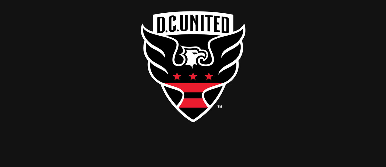
For the first time in nearly 20 years, D.C. United will enter an MLS season with a new logo.
D.C. United revealed its brand new crest on Thursday evening to usher in the club’s first rebrand since the 1997 season and only the second since the club’s inception. The new logo, which was unveiled at a season ticker holder event, features a new shield, an updated word mark, an eagle and stars and stripes meant to represent the city of Washington D.C.
D.C. United Chief Operating Officer Tom Hunt went on to state that the new design, which was the result of two years of market research, “is more of a modern evolution than a revolution”.
According to the team, the new shield is based on the George Washington family crest, while the red and black stripes are meant to represent the flag of Washington D.C. The eagle, which has been a part of the club’s crest since its founding, is now seen facing to the right, signaling the idea of looking forward.
The logo reveal is meant to coincide with the club’s stadium plans, as D.C. United is expected to move into a new soccer-specific home in Buzzard Point in the coming years.
What do you think of the D.C. United logo? Any complaints? Where does it rank among the league’s best?
Share your thoughts below.


huh, it’s…actually not too bad. recent redesigns (not just dc united, but in general) have left me cringing every time i hear of another one, but this looks clean and simple, if not perfect.
Its definitely looks more modern, but I’m not a fan of the wings extending out of the shield, or the corset shaped flag, or the lack of red. I’m sure it will grow on me, but the old one – while dated, had a sense of balance to it that this one lacks.
My only complaint is that I’m not to fond of how the lower half of the shield frames the tail. I think it might look a bit sharper with only the eagle and the “DC United” banner over top. The wings could end up looking less…*something*…grand?…flowy?…out-of-place-y…if the lower shield borders were removed.
Other than that…. dig the colors, dig the eagle shape, dig the stripes and stars.
Vamos United!
Clean look. DC has maintained a solid log, but I actually agree with Neal. I hadn’t considered that before I read his comment.
Not a fan of how the wings extend outside of the shield, but at least this is more of an update than a change.
Great updated logo. They could have changed it all but they still with the tradition and I love that. Part of the reason I love the club. Vamos United!!