
Los Angeles Football Club is still two years away from taking the field, but the club made a major step towards establishing its identity on Thursday.
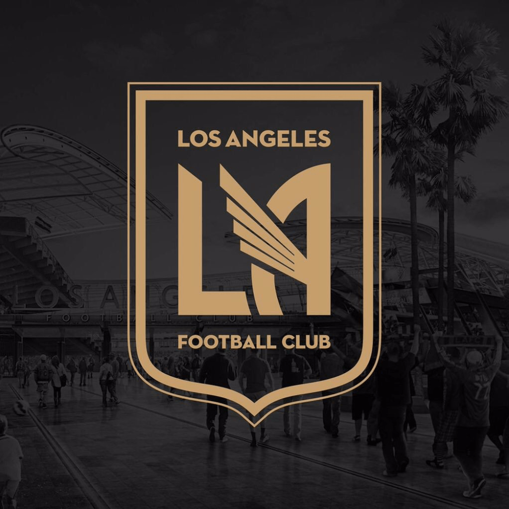
Set to begin play in 2018, LAFC unveiled the club’s logo and colors on Thursday. Featuring a black-and-gold color scheme, the logo features what appears to be an angel’s wing to symbolize the city of Los Angeles.
Prior to Thursday’s reveal, the club had been using a red-and-black color scheme as placeholders until the official change to black and gold.
LAFC will enter MLS in 2018, joining Atlanta United, Minnesota United and David Beckham’s Miami project in the next round of the league’s expansion.
What do you think of the LAFC logo? Where does it rank among the league’s crests? Like the color scheme?
Share your thoughts below.
http://31.media.tumblr.com/8817dd28d01ac8f17dcc398a90ad93ea/tumblr_mw2mgbPqYO1ssuoa0o3_250.gif
Strikes me as a purposefully simple, extremely well-executed, and very explicit attempt to wrest the LA mantle from the Carson Galaxy. The logo/colors are impeccable (gold recalls the Oscar for me) and the gold “LA” wing mark has the potential to become iconic. Merch will fly off the shelves, and not just in Southern California.
yep.
I like the simplicity of it. Even with the angel wings it avoids the cartoonish nature of some of the league’s crests and badges which I don’t find appealing. The only minor reservation I have about the crest is that it somewhat mimics the other Los Angeles team’s crest idea in how they both now make “LA” the most dominant feature. But, overall well done.
Top shelf, except:
– Gold is a miss. Was Tyga part of the product testing group?
– The Raiders are moving back to LA. Black and gold seems like an “also ran” to black and silver.
Well, the marketers are going for “young” consumers. That’s something Tyga can relate to.
Gonna sell sh!t ton of merchandise. Sold look and color scheme. Def going to get trendy.
Liked it a lot this morning. By this evening, it has grown on me even more. A very clean graphically pleasing design and color scheme that will stand the test of time. Well done.
Serie A-like. Grazie, grazie.
Bravo to the design team. Very well done. Really attractive, and seens truly connected to the pulse of LA. The golazo shirt is pretty dope.
Black and Gold! Same colors of my High School Alma Mater- Bishop Montgomery in Torrance, Ca (also the Alma Mater of Sigi Schmid ) But while I don’t mind the colors, or the General Design of the crest which is reminder of Richard Nuetra, a US-Austrian Architect, whom, and I don’t mean to denigrate a good architect, was mainly a residential architect, and I HOPE LAFC does not mimic his architecture which IMHO is pedestrian.
The LA Coliseum, next door to the proposed LAFC stadium, The LA City Hall, the first LA City skyscaper , LA’s Union Station, and several significant buildings on the USC Campus (next door) and several building in the LA Exposition Park (where the LAFC Stadium will be built were ALL DESIGNED by John Parkinson a very noted Architect in LA which gave it the noveu look so associated with the City of Angeles. While you cannot hire him or his architectural firm. I would hope that LAFX would incorporate design elements into the new stadium to make it “fit” a historically important part of the city.
I am a native born Angeleno and worked once as a city planner and for the City of LA. I hope LAFX does right by the history there.
While I genuinely admire your interest in the history of Southern California architecture, your comparison of the LAFC design to the work of Neutra is specious. Along with Rudolph Schindler, Neutra defined LA mid-century modern architecture. Sorry to flame you, but don’t you dare call Neutra pedestrian! Unless you consider THIS pedestrian:
https://en.wikipedia.org/wiki/Neutra_VDL_Studio_and_Residences
You are, on the other hand, quite accurate in your assessment that the LAFC crest is a call back to the earlier architectural style of LA, art nouveau. The winged text and gold palette points directly at the work of the Parkinson Brothers. One can plainly see the design thru-line from LA’s Union Station and Grand Central Market and the LAFC crest.
Good on you for taking note of all these design details. And good on LAFC for taking this neoclassical design approach to their integration into the City of Los Angeles.
City planner for LA, huh? So, you’re the one we can blame.
Now when do the Aztecs return to nasl or usl?
The standalone LA logo is sick. Going to see a lot of people wearing black hats with that LA logo on it in gold.
this is or I guess will be the best badge in MLS
No way, Minnesota or Orlando…
too simplistic. maybe this could become the simplified logo at some point while they develop a more… ehhh… ?robust? design. teams are going too far with the less is more fad.
check it out when applied to stuff.
Its a really clean design, only badge in MLS I would call beautiful
http://www.matthewwolffdesign.com/portfolio/lafc/
Thanks for the link Mouf. I agree, looks good.
Thanks for the link. I was especially sold by the “LAFC” shown at the base of the badge breakdown image.
Less IS More though. Just because European football badges are complex, doesn’t mean we need to copy that styling. Keep in mind, 95% of those badges are almost or over 100 years old. They have history, we’re creating our history in this century.
Less is more. I like these sleek designs that look the polar opposite of MLS 1.0’s cartoon-like shenanigans.
First glance, I thought the wing was very close to Minnesota United’s loon wing. Second look, its different. Don’t really like the wing, but oh well.
Very nice. Stil don’t understand why they aren’t called United like every other MLS team though. Oh well, at least they are named after that other sport that LA will soon be getting.
Toronto FC is not called United and they are in MLS!
Great name! Just blows me away how they keep coming up with such dynamic, charismatic might be the word I am looking for, names!
Well done.
Sarcasm much?
You seriously need to change your handle name!
Crest looks great. And let them develop a nickname over the year instead of a marketing department concept.
Love it. Very LA.
Like this. So glad they dropped the red. Now if they could only apply some more inventiveness to coming up with a better name.
I like it. Simple, classic and pulls stylistically from Hollywood’s heydays.
Thumbs Up
Incredibly predictable, but cute nonetheless.