
By RYAN TOLMICH
With the 2014 World Cup in the books, FIFA has now turned its attention toward the tournament’s next incarnation.
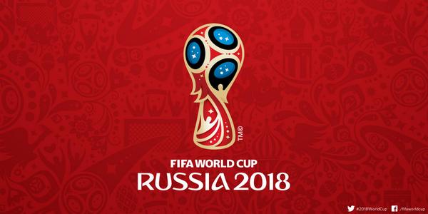
The official logo for the 2018 World Cup was unveiled Tuesday by Russian astronauts at the International Space Station. The new emblem was simultaneously projected onto the Bolshoi Theatre in Moscow, the city in which the final will likely be held.
“The emblem is the visual representation of the tournament,” said the chairman of the Russia 2018 LOC, Vitaly Mutko, last week. “Winning the right to host the FIFA World Cup was a dream come true for millions of Russians. To creatively capture the essence of this remarkable historic moment inspiration was drawn from both Russia’s rich artistic tradition and its history of bold achievement and innovation. I hope that fans around the world will appreciate and love the Russia 2018 emblem.”
“I’ve witnessed 10 World Cups,” said FIFA president Sepp Blatter. “The first one I experienced first-hand was the 1954 World Cup in my homeland Switzerland. The launch of the emblem is a wonderful event to kick things off and I’m certain that the World Cup will be a success here in four years.”
—-
What do you think of the World Cup logo? How does it compare to those of the past?
Share your thoughts below.
only option for Blatter, Platini and FIFA to keep advancing russia WC 2018… russian mob will eliminate them if FIFA backs out.
So we should hope FIFA backs out, right?
The Russian Mafia: For The Good Of The Game. 😀
The red represents all the blood they’ve spilt in the Ukraine. Gold represent the wealth of their mob-acacy and the bribes paid to fifa and the blue the coldness of their hearts
Woah hey, that’s slanderous to say Russia bribed FIFA. I mean lets be honest. They probably threatened them.
+100,000,000….
Looks a bit like a matroska doll from the side. Maybe I’m just seeing things though. Big eye on the right and the two other blue circles on the headcovering…
It looks like they worked off of Brazil’s logo, added some red, stars, a ball, some people with their arms in the air, some Russian culture and football in the background, and said, “It’s goodskis.” It’s not a bad thing per se, but I thought they would think of something different.
My first impression too. Did they actually start with a new file, or just pay some guy on fiverr to Photoshop it?
Having said that, I like it.
My first thought is “Go Cougs!” (and I’m not even a WSU fan or alum).
So they went with red white and blue. With white stars in a blue background and red and white stipes intermingaling.
In soviet russia…logo unveils you
that is deep
If you turn it upside down, it sorta looks like Crimea up in flames.
winner…
you’re a genius and a sick man!
lol
It’s not “$”?
7/10
I’d give it a 10/10 but it lacks the 45-degree “slash” referring to soccer’s speed and energy and illustrating both the nonstop nature of world’s game and the rising trajectory of the World Cup’s popularity.
+1
I am surprised they went with red…..