By RYAN TOLMICH
When the U.S. Women’s National Team heads to Canada for this summer’s World Cup, they will do so with a brand new look.
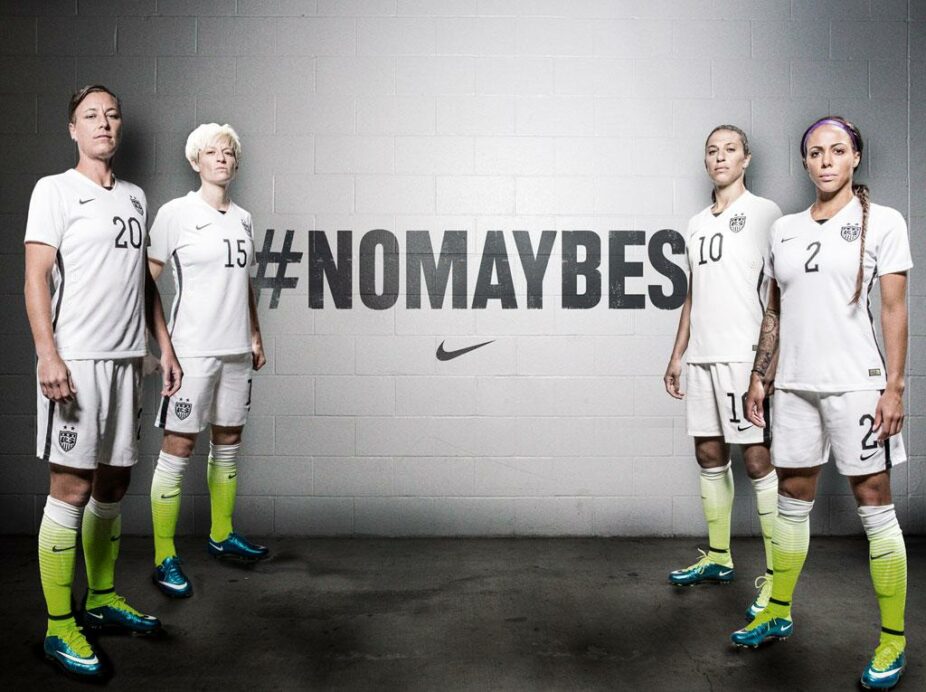
Nike revealed Wednesday that the USWNT will feature a brand new home kit to be worn in this summer’s World Cup, which takes place from June 6 to July 5.
The latest iteration breaks away from the collared look of previous kits, while also changing the color scheme away from the typical red white and blue. The new home jerseys show to be mainly white with black trip, while the team will sport socks in a hue of neon green.
The reveal comes comes just over two months after Nike unveiled the team’s latest away jerseys, which are predominantly blue and have been worn by both the Men’s and Women’s National Teams in recent games.
—
What do you think of the new jerseys? Would you prefer a more traditional look? Plan on buying one?
Share your thoughts below.
Nike is just the worst, simply the worst with US soccer kits. And I call them that because they know better and should do better. The design – not the worst they’ve done and it could have been acceptable with the right colors, but white with BLACK trim. Was navy or red simply the too obvious choice? But then Nike goes and does that Nike thing with the socks. Neon… green. So we are the USA Sounders? FFS Nike, or US Soccer, or both. This is really getting old.
I already hear the soccerphobes who think that Soccer is unAmerican are pointing to the lack o f read and blue in the kits as another example of why soccer is bad for this country. Terrible.
Nike gave up on these uniforms. Were they running close to the deadline and have no ideas? Is this what them men will be wearing this summer? Great.
Maybe the men will show some backbone and refuse to wear it. And if not, then change the name from USMNT to Team Nike.
It was bad enough when dressed as popsicles or in the where’s waldo stripes, or even in the latest I-can’t-play-like-Italy-but-at-least-I-can-wear-Italian-blue, but at least those were loosely reminiscent of varying shades of our national colors. Green? Really? Is this all about Nike now? If so, count me out.
Too bad they won’t be topless. Therefore, I am not watching.
Grow up.
Another proud moment for the ol’ Red, White, light (aka Italian) Blue, and… neon Green?
Maybe we should fire the American company and hire the German company back – at least they know the shades of our national colors.
Boo.
#FireNike
Didn’t know I was supporting the Kiwis this summer…
Terrible!
I don’t mind the kit, it’s the first one I’ve liked since the Centennial kit. However, those socks and green boots are terrible. As a Portland area company , Nike should stay far away from anything that resembles rave green.
Nike just loves their neon green. Seriously, when does the Nike contract with US Soccer end? I’d like to see what a different company like Under Armour would come up with.
I can’t move past the color. Forget if you do or don’t like the design. We are the red, white, and blue. This is not us.
Weird.
As I was scrolling down I thought: ok they have gone with a plain jersey… not bad… and then all of a sudden: what the?! Are those socks turning green at the bottom?… must be some kind of mistake. Click on the link: sure enough still green… scroll down to the comment section, everyones reaction: GREEN SOCKS! Me: dumb founded.
Weird Nike, just plain weird.
Cleary someones copying Mexicos recent changes to the black, white, and fluorescent green……
!!!!!!!LOUD NOISES!!!!!!!
The blandness will make the flashy coloured boots stand out even more.
I, unlike the majority of you really like these new kits(socks not so much though)! I’ve noticed a lot of nations going away from their traditional color schemes and who knows, they may look even better on tv! I don’t see what it’s going to hurt to switch things up a little bit from tradition? We need to get behind the team and the kits, the women are going to need our support this summer!
I’m not supporting anyone in green socks. Sorry.
I maybe in the minority but minus the socks I don’t mind the simplistic kit even if it’s just black and white. I’ve noticed lately that Nike, particularly on websites that focus on new football boots into the market, is introducing more and more boots where black is the predominant color. The boots may be trimmed in loud colors while donning wild laces but black is back. If that’s the case this kit follows along those lines.
Just looked at the picture again. Question – what does the left side people have in common?
They combined for one of the most exciting goals in USWNT history?
They have short hair?
They listen to Indigo Girls music?
They are on the left?
Be careful of your use of ‘left’. Katy Perry’s lawyers may come after you…
huh… another US jersey that is kinda okay.
i could probably copy and post my comments from the last few ones.. lame. time for Nike to start treating US Soccer like their other big clients; who they are awesome for.
anyways il be rooting for the Green, White and Black this summer! no not the UAE or Afghanistan the USWNT!
also will the men’s team be wearing these at the Gold Cup?
A Nike intern mistakenly faxed a black and white photo of the kits to the factory. The intern used a highlighter to indicate where the Nike logo should go on the socks. This is the story that I’m going with. It makes more sense than an intentional decision to manufacture what appears in the photo above.
wish i still had a black/white tv to watch US & MLS games on..
Awesome! I am copying and pasting this into another comment site and claiming this work as my own!
Is there anyway the US fans could get Nike fired? These are just blah, except the socks which stink. News flash Nike, our colors are Red, White and blue…. not white black and green. Why can’t US Soccer get a vendor that has a clue?
PS – they are better than the crap the men are wearing
Damn, that is just plain pathetic.
White and black??? Boring as hell. That put me in such a coma that I didn’t realize the socks until I looked at the comments!!!!! WTF is the deal with those socks!?!?!?!?!?!?!?!
dude, black and white are the colors of the masses. They are trying to appeal to the masses, not to enlightened fashionable urban hipsters like you and me. Think of the overweight Walmart crowd, thats who they’re trying to appeal with their blandness
Pathetic… you have the Nike football department making amazing football jerseys for Oregon and this is the best they can think of? That’s a training kit! Haven’t bought since the Centennial kit, drought continues.
same. drought continues.
I have had a $100 gift cert to ussoccer.com since just after the centennial kit disappeared forever. Haven’t yet seen a jersey I wanted since then. Even essentially for free. And I went to Brazil, too.
Someone needs to be fired over US Soccer green-lighting a Nike ad, I mean uniforms.
I’d suggest Gulati fall on his blade.
100% ‘murican. Grass stained socks, probably made in china, large corporation. DGAF design. This screams freedom.
Grass stains on the socks are perfect for turf.
The socks should be red, instead of green, to hide all the blood flowing from turf burns.
Unbelievably terrible. Yellow?
color blind too?
Apparently they are green…yep. Still stupid.
Hard to differentiate on some monitors, to be fair.
Are those green socks? Or is this one of those dress color things?
The socks are quite obviously the worst part… but what makes it even more egregious is the fact that the socks are meant to match/flow into the design of the Nike boots, which also have the green. That’s just Nike making the entire design about them, not the team the kit is meant to represent. I really, really hope this design isn’t used with the men’s team this summer.
i have been hearing for a while that nike has been trying to impose the ‘volt’ – neon green/yellow design/color on US Jerseys. looks like they got their wish imposing their ‘brand’ on our ‘team’
They are trying to make up for the fact that there won’t be any grass stains on them…