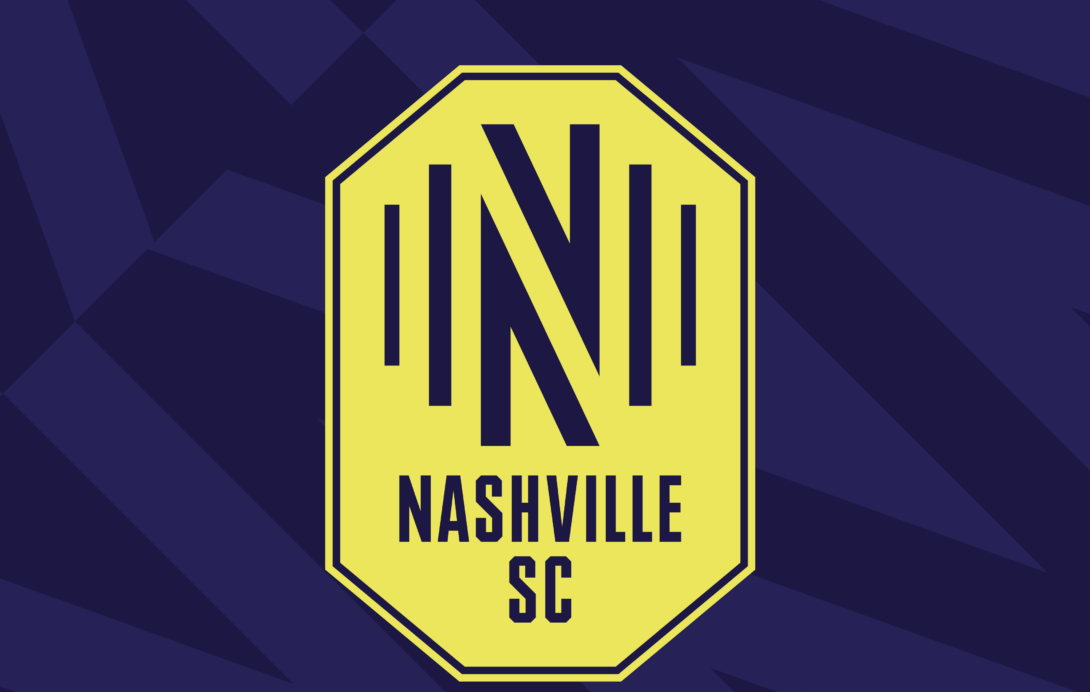
Nashville SC will kick off play in Major League Soccer next season, but the club has their official name, colors, and crest for their inaugural campaign.
At a club event on Wednesday evening, Nashville SC majority owner John Ingram and CEO Ian Ayre announced the club will keep its current name as it transitions to MLS. In addition, the team’s official colors will be acoustic blue and electric cold. Their crest is to represent sound waves for Nashville’s nickname “Music City”.
“We wanted a name and an identity that was authentic in the sport. It says exactly who we represent and who we are, Nashville Soccer Club,” Nashville MLS CEO Ian Ayre said. “Our announcement is another step forward, and we have many others to take, but it is important to start that with a clear identity of who we are. Gold is our primary club color, and we need to own that color in the sport. As we grow as a team we want to be recognizable by our color, our name and our values as a club.”
“It was important to us that we started that by bringing the brand to life in a uniquely Nashville setting with our supporters, our partners, our owners, Major League Soccer and everyone who made this possible, and of course with music! Throughout 2019, we will be doing our best to bring everyone along on our journey as we #BandTogether Nashville & Soccer on our march to MLS.”
#BandTogether will be the club’s inaugural season hashtag for 2020 while Nissan Stadium, the current home of the NFL’s Tennessee Titans will serve at Nashville’s home field for at least one season. A new 27,500-seat stadium at The Fairgrounds Nashville will be constructed prior to the start of the 2021 season, in which Nashville SC will make the move over.
“Since I first got involved in this effort, I have said that I wanted to do something ‘In Nashville, for Nashville, with Nashville.’ This team will always be about the fans and creating a team and brand that they are proud to support,” Ingram said in a team statement. “The Nashville SC name and primary gold color, along with the themes of sound and energy in the logo, embody our city and our fans who have been with us from the start.”
Prior to 2020, Nashville will play their final season in the USL beginning against Loudoun United on March 9th.


“Tenn SC” is a missed opportunity.
None of your opinions matter! Hahaha enjoy the comments section while anyone with power literally ignores you all.
Nashville SC investor is that you?
As someone who went to Nashville for a bachelor party last September, I can confirm I am in fact a Nashville investor
Tacky AF. Better name would Ass Clown SC with those colors. What waste your Nashville where y’all go triple platinum should have made the colors should have been Triple Platinum and Record Gold. Y’all gonna suck anyway so get used to it.
—
A————-T—————-L
Music City SC. Do something different. Put guitar strings in the logo. Yawn. This is a missed opportunity for such a unique history.
…For a city with such a unique history
If I were a Nashville fan, I would be pretty upset about that crest. Good thing I’m not.
Let me say for the record before I say this: as an ATLien, I’m gonna hate this team. As someone who has family in Sacramento and San Antonio (both deserved this MLS slot more), I’m DEFINITELY going to hate this team.
So that being said…their crest looks like a barcode. Awful.
???? people will be bringing red lasers to the game
The crest looks like a traffic sign in europe that i don’t understand. Nashville SC is kinda bland as well. They should have just gone bold and went with “Music City SC” lol. oh well… still waiting for the Republic to get their bid..
Yo???
Like the name and colors but I think they could have done more with the crest. I liked their USL crest and I thought they had opportunity to create something truly unique.
Crest is no good. But I like an “SC” instead of another “FC”.