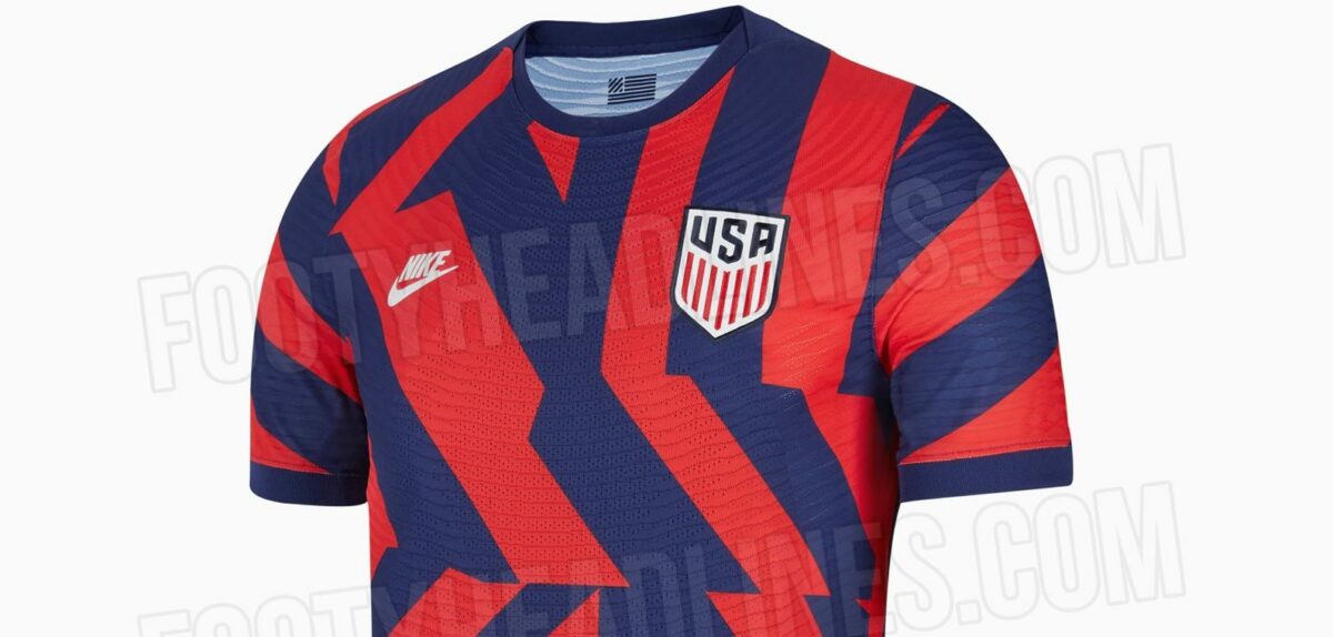
A new U.S. national team jersey may be on the horizon.
Ever-reliable FootyHeadlines.com posted an image of the apparent away top that both the U.S. Men’s National Team and Women’s National Team will wear for parts of 2021 and 2022. The kit features a dazzle camouflage design in navy blue and red, a round collar, the classic Nike ‘Futura’ logo on the right part of the chest, and is expected to be officially unveiled soon.

FootyHeadlines.com also unveiled the reported new training jersey that both national teams will use. The top is predominantly white, but includes a gray abstract design all over the front and navy blue touches on the round collar and left sleeve. The Nike ‘Futura’ logo is emblazoned on the right chest area.

The current away kit that both teams use is a predominantly blue top that includes different tones of that color as well as red accents. The training jersey used right now is also navy blue, with red and white diagonal stripes on the left sleeve. Both of those items of gear were debuted in 2020.
What do you think of this reported new USMNT and USWNT away jersey? Like the design or think it is too much? Do you prefer the training top?
Let us know your thoughts in the comment section below.


Ugly is putting it mildly. Maybe they are trying to appeal to the younger generation but I don’t know that anybody has that much of a lack of taste. To see all of the nice jerseys at the Euros makes me sick that this is what Nike puts out for their home country.
i’ve decided that one of the main things that irks the eye is in several places the pattern just stops and it’s almost like you sewed different parts of the pattern together. so you have loud colors, loud design, and then the design doesn’t even flow from one end of the shirt to the other.
pinstripes are continuous, a sash is continuous. the sash doesn’t go to a point, break in half, start up elsewhere on the shirt.
I’ve decided it’s designed specifically for the qualifying games in Mexico City. Mexico’s players will see these jerseys and panic, thinking it’s an earthquake.
it is being officially advertised (and sold in the online shop) as the new road jersey.
Someone sewed some fabric scraps together. Hideous.
This is just awful who at USSF is in charge of signing off on these jerseys. Truly I want the name of the person who signs off on this trash. Just another jersey I am not going to purchase. Best of all time was the Centennial jersey especially the crest. Classic and timeless that will not go out of style. Just tweak it each year and USSF will sell more jerseys and would make more money. They are not going to be selling as much of this trash as they think they will.
This could be a good kit if the lines were straight, either horizontally or vertically, alternating between the red and blue (and perhaps some white too). Then, let’s make that the general foundation template for future jerseys
On the other hand, this could end up in the same vein as the Waldos, since this is (or the Waldo’s case, was back then) quite bold, but could win people over through time.
It also could be accepted if the team wins and have iconic moments wearing this shirt.
This looks like an experiment gone wrong
gross, my only hope is that’s a short sleeve keeper jersey.
Fugly is an understatement.
Nike has been saving money by taking artwork from 5 year olds and slapping it on it’s jerseys. No need to pay designer staff.
Whoever designed that shirt should be fired and never allowed to design anything ever again. Ever.
Barf
get that shit out of here. i’ve skipped the last 3 jerseys and will skip this shit too. gross.
Fugly
Please, no.
It might distract our opponents during games. Maybe even make them dizzy. So there’s that.
Nike can come up with something as lovely as Finland’s Euro 2020 home kit and then they stick us with this trash? It’s somehow even worse than Manchester United’s Adidas third kit. I cringe to think of what the home kit will look like. It’ll probably be pixelated or look like a Jackson Pollock painting or something. With a zig-zag strip down the side of it. Garbage.
The light one has the VW logo on it. So probably the gold cup training shirt. Or pre match