
By MIKE GRAMAJO
ORLANDO, Fla. — With only four months to go until their Major League Soccer debut, Orlando City’s identity is coming to fruition and they’re bringing purple with them.
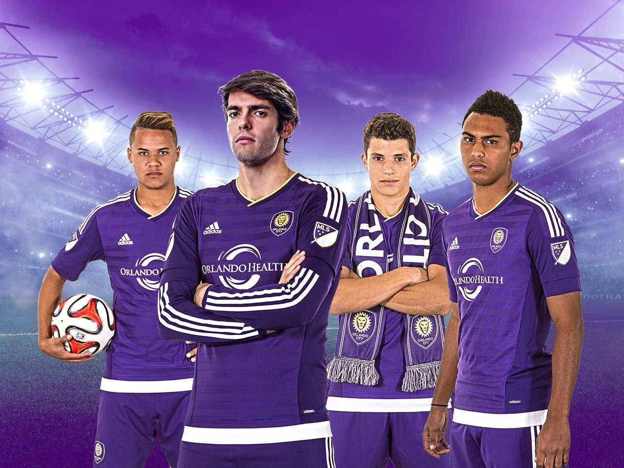
Orlando City Soccer Club revealed their inaugural MLS home kits, designed by Adidas, on Wednesday morning. The jerseys will be available in stores Dec. 1.
“We wanted to make sure we had a unique item. We wanted it to be classy and special and it’s a piece of Orlando,” said club president Phil Rawlins. “They will be ready by the first of December. We were promised the shipment by Adidas that they will come in between Nov. 15 and Dec. 1, so we hope to have them on sale for the first. We’re a club of the fans. We’re here for the fans, it’s about the fans and community.”
The purple jersey with dark purple hoops also features a gold neckline and gold crown silhouette on the back, which pays homage to the team’s USL titles. The club’s USL badge is stitched into the inside of the shirt.
Orlando Health will remain as the team’s shirt sponsor heading into MLS after four years of sponsorship in USL Pro.
“It’s a great kit and has a lot of meaning,” said Luke Boden, who recently signed his MLS deal with the Lions. “It feels different, it breathes a lot more. I like how fans played a part in the home kit, it’s a great shirt overall.”
Fans can preorder online; season-ticket holders receive a 10 percent discount. According to Rawlins, the away kit will be unveiled during MLS Jersey Week, which usually falls in the first week of March prior to the season opening. A third kit, however, is not in the plans for the club in 2015.
Up next for Orlando City is the MLS Expansion Draft, set for Dec. 10. OCSC has the first pick after beating fellow expansion side New York City FC in the expansion priority draft in October.
————
What do you think of the new kit? Do you like it? Hate it? Happy to have a team wearing purple in MLS?
Share your thoughts below.
Looks good. Should be unique in the league.
My only complaint is how Addidas pushes such a sloppy & uniform (pun) style on every jersey they make. But thats not changing anytime soon. Wish that there was some diversity in jerseys styles in mls like other leagues.
Overall one of the better jerseys in the league. -and good call making them available 12/1/14!
Not bad. I wish the stripes on the sleeves were gold instead of white though.
any word on how much Orlando is getting from their shirt sponsorship?
For some reason this reminds me of Grimace.
Please let McDonald’s become their kit sponsor!
Adequate
MLS Reasoning: “If it ain’t Red or Blue, it’s crap!”
Fun Fact: this Jersey is Red and Blue, they just mixed them together.
they have the old logo/shield (with the three lion heads) on the inside of the jerse, right behind where the new logo/shuield is. pretty cool
Yes, nice touch.
I like them, good to see purple being used in the league…
Orlando City Purple People Eaters
Harchester United wore it better….
+1
+2
Karl Fletcher was unstoppable!
Lord how I wish Amazon Prime would have the episodes. I might even would pay for a couple months of Hulu for that.
A quick search revealed that Youtube has episodes.
Actually Karl Fletcher was very stopable. by a hook on the wall in the dressing room as I recall.
Not bad but too much purple, add some some gold but thank god no more blue or red.
Teams like revolution, Los Angeles 2, Miami, Atlanta, Sacramento should have good colors ( that’s if Miami and Sacramento get in which is obvious)
Los Angeles 2 name should be Hollywood stars or inter Hollywood with sexy Hollywood colors, same thing with Miami.
Long ago, my job included describing over the phone the differences between various shades of red, blue, etc. and helping customers choose complementary colors. But you’ll have to help me out: What are “sexy Hollywood colors”?!
some neon colors or a rare mix not use in mls, kinda like retro mls, not so retro but look at all the college football uniforms.
For example, we all know there’s a bunch of colors when buying a car and its so weird mls teams don’t think outside the box.
No more blue,red and MLS needs green, brown, pink, yellow, turquoise, gold, silver.
Did someone say, “sexy + gold?” Lo, I present to all of you, LAFC’s new home kit: http://i288.photobucket.com/albums/ll190/lbCharmed1/PamTonyHelene.jpg
Nice, Hollywood LA stars or Hollywood stars fc
Now we just need a brown team to fill the original 1903 crayola box!
Sacramento
yawn.
yeah, sure, why not?
They look nice. The only curious part is that white stripe at the bottom. Also makes it seem as if there is an undershirt.
+1 very curious.
That is curious. Their club store doesn’t seem to have that at the bottom on the photos of the kits. Maybe you put them on and an undershirt magically appears?
Or maybe the whole outfit comes with a shiny white belt?
that would be fierce!
Ooooh Noooo, he didn’t!!!
That is odd. Another oddity: the long sleeves look as though they are literally just extra fabric sewn onto the ends of the short sleeve jersey.
You mean the design element that everyone and their mother is gonna start copying because it represents the only real innovation in kit design for quite some time? yeah…. leave it alone. Its fine. 🙂
All kits should be designed by Adidas.
My vote is Puma, but adidas is a close second.
I can live with Puma as a second choice. There is a certain company about 800 miles north of where I am sitting that I would like to see go out of the soccer kit business, especially when it comes to the US National team.
Puma ruined (or is in the process of ruining) it with their uber skin-tight kits. Uruguay and most of the African nations at the World Cup and then Arsenal this season…. not my thing.
NO
adidas, nike, and puma all make some great kits…
and they all make terrible ones also
i cant deny the commitment adidas has made to sustain MLS but i hate the monopoly they have on the league
if every club & national team kit were by them it would mindnumbingly boring